
Welcome to Week 5 of the SciFund Challenge 2016 Poster Design Class.
We’re just about at the finish line. Finally!
But don’t relax just yet. You can find yourself spending a lot of time making minor adjustments and tweaks. Not only that but you still need to prepare for your presentation. We hope you didn’t think that once your poster is complete, everything else will fall into place.
But don’t worry, we’ve got you covered. This week we’ll be focusing on making the final tweaks to your poster as well as on making the most of your actual poster session.
In Week 1, we discussed the importance of identifying career goals that you would like to achieve at your poster session. Then in Week 2 we focussed heavily on the narrative of our poster. Now it’s time to combine these lessons to plan our poster presentation (you know: the part where you have a conversation with your audience at your poster). As you will see, it is not enough to have a great looking poster. To have the most impact, your presentation and poster will need to be in perfect harmony.
Remember, one of the main goals of presenting a poster is to make a connection. So let’s connect!
Finishing Your Poster
Now that all of the major poster content is complete (or near completion) we can focus on basic style modifications that can make a big visual impact. One of the easiest and most common additions to a poster will be the addition of a background.
Poster Background Design
A poorly done background, will RUIN your poster. If you can’t figure out how to make it work, don’t include one. It’s just not worth it. Black text on a white background is a classic look that will never go out of style.
But if you want to experiment, we have a couple of suggestions for you.
Using a photo
We’ve talked about image quality in Week 3. If you are going to use a photo as your background, it better be a high resolution photo. If you stretch a low res photo, you will end up with a very pixelated and distracting image that will only detract from your poster presentation. You’ve worked hard to have a compelling and beautiful poster, don’t get lazy now!
If you do have a high res photo, make sure that it does not interfere with your text and ruin your poster contrast. Check out this poster shared by Emily Austen at a recent conference attended by Zen:
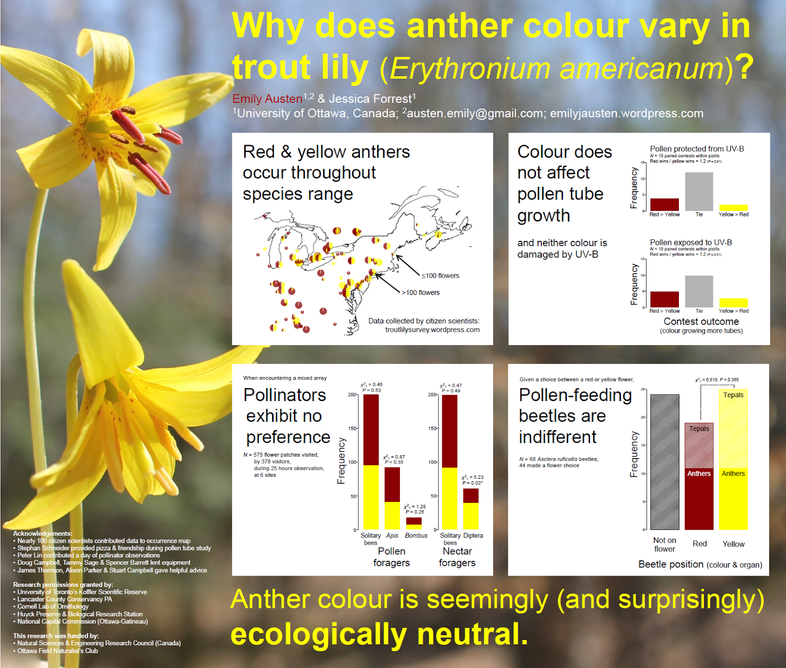
The background is very subject oriented, and the subject just so happens to be the flower in question. Notice the very shallow depth of field of the image, so the entire background is out of focus. This keeps attention on the data. Additionally, the flower color scheme plays an important role in the poster itself. Emily further distinguishes her data by creating white boxes that surround her data.
Another helpful technique is to manipulate the opacity of an image, or object. In Illustrator you can do this via the Transparency Panel, while in Inkscape this can be achieved with the Fill and Stroke Panel, or in the Layers Panel. By manipulating an object’s opacity, you can lighten, or darken, your photo depending on the object/color behind it. If the only color under your photo is the white artboard (which will also be your paper color), then your photo will be lightened. It will almost have a bleached effect. If you have a black background behind your photo your photo will be darkened.
Since text is by default black and you’ve probably gone that route as well, lightening a photo drastically will give you that same level of contrast. If you’ve gone with white text, you’ll want to darken the photo.
Creating a simple background with pizzazz
You can also choose to keep your background simple. If you’ve created a poster color palette you can use one of your palette colors (preferably the lightest or darkest to contrast your text color) to create a simple background.
You can also give that color some texture in a very simple way and it works similar to the transparency method above. But first you’ll need some textures.
Textures are raster images of basically nothing. They can be ink blotches, watercolor paintings, textured paper scans, etc. This list has some great textures you can work with. Like working with photos, you’ll want these image files to be high resolutions. But even pixelation in this case may not be a bad thing. The pixelation may give you a cool result once you apply some transparency effects to it.

To create a textured effect in your design, first place your image into your design file (Illustrator:File > Place, Inkscape: File > Import). Many textures are colored so you could (in theory) just place your texture, stretch it to the size of your bleed marks (remember this?), move it to the background (using the layers panel, see below for more details) and then change the opacity to get a lightened textured effect.
The fun begins when you add a colored object behind the texture. The simplest thing to do would be to create a rectangle the exact dimensions of your texture image. Pick your top object (which should be your texture image) and use the dropdown box (where it says “Normal”) to mess with the transparency properties of the texture. Experiment with all the options and pick the effect you like the best and works well with your poster design.
You can maintain this effect and make it a bit more subtle by adjusting the opacity. Try a number in the 10-30% range to give a slight hint of texture in the background. Remember we want alluring, not distracting.
Patterns in Illustrator
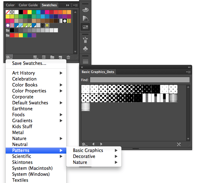
In Adobe Illustrator, you can also generate patterns quickly using the Swatches Panel, which we introduced you to last week. You can use the preloaded patterns which are loaded in the Swatches Library (see the image below). Just select any vector object and click a pattern swatch. The object will then be filled with the pattern.
You can even try to make your own pattern or download a free pattern to use. This site has a list of hundreds of patterns you can implement. To make your own pattern you’ll need a bunch of objects. Just select the objects comprise your pattern and then drag them into the swatches panel like you would to make a color swatch. Now you can apply that pattern to any object. If you’d like to make your own pattern, this video tutorial may be helpful. If you have Illustrator CS6 or above, there is a handy pattern generator tool that makes pattern creation a breeze (video tutorial here).
Anthony’s ONS poster actually incorporates all three of the above techniques for the background.
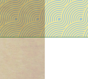
In this poster, a texture was brought in as the background. Then a pattern was colored, created, and used behind the texture. He applied a transparency of 50% to the texture and the Multiply effect (in the transparency panel). To make the pattern a bit more subtle, a transparency of 50% was applied to that.
Patterns in Inkscape
Working with patterns in Inkscape is a bit different from Illustrator. But there are a couple of different ways that you can make patterns in Inkscape. The first is via the Pattern Fill Option in the Fill and Stroke Panel:
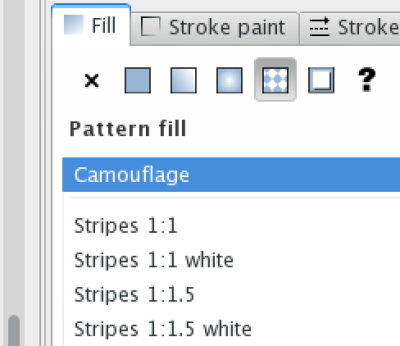
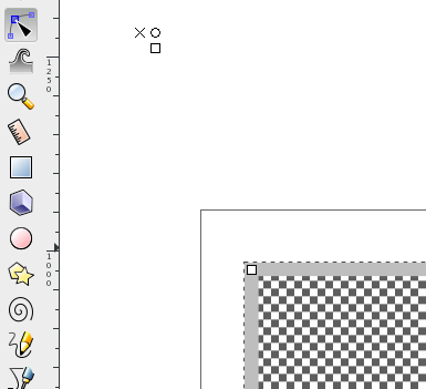
Click the Fill tab in the Fill and Stroke Panel, and then click the Pattern Fill Icon (see above) to fill your shape with a pattern and select a pattern type from the dropdown list. Using the Node Tool (looks like an arrow pointing at a square, right below the selection tool in the Left Panel) you can adjust the pattern fill by clicking your shape and then manipulating the pattern nodes. Note: You may need to zoom out to see the pattern nodes, as seen here:
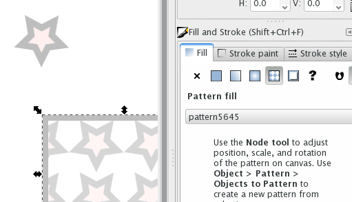
Additionally you can make a pattern if you already have a pattern shape (like what you’d get if you downloaded a vector pattern). To do this you just need to create your pattern tile (the thing you’d like to have repeated for your pattern) and then click Object > Pattern > Object to Pattern. Now in the Fill Tab (Fill and Stroke Panel) you will find your new pattern in the dropdown list of available patterns under the Pattern Fill Icon.
If you’d like to try this method, this site has a list of hundreds of patterns you can implement. Practice a bit and get used to the pattern generation process.
Anthony’s ONS poster actually incorporates all three of the above techniques for the background.
In this poster, a texture was brought in as the background. Then a pattern was colored, created, and used behind the texture. He applied a transparency of 50% to the texture and the Multiply effect (in the transparency panel). To make the pattern a bit more subtle, a transparency of 50% was applied to that.
Make your poster interactive
Another way to make your poster engaging is to make it interactive. These days many academics have access to a smartphone. Why not make use of that by providing interactive objects like links and QR codes that take your visitor to a video, lab website, contact information, or your archived poster (more on this later).
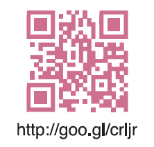
The above QR code is from the ONS poster and will take you to the link shown (which points to another link). Some QR code generators will allow you to download a vector version of the QR code, which will allow you to adjust the color, or even embed a logo or other image.

Whenever you use a QR code, test it to make sure it works. If it doesn’t work, it is not a good use of your poster space.
You may have also noticed the use of a link in conjunction with a QR code. This is done for two reasons: (1) there may be an error with the QR code and it doesn’t work, and (2) some people just don’t use QR codes but have full capabilities to scan one. It is always a good idea to provide the link embedded in the QR code next to the code. Consider using a short link (bit.ly or goo.gl) for ease of use and readability. The short link also gives you the capability of monitoring usage stats. This would let you know if anyone scanned your QR codes while you were not at your poster.
Providing some interactivity will give your poster that last impression, give your audience something to take away (like your contact information), and will not require much space. QR codes for instance may only require about 2.5 x 2.5 cm of space. Links are even smaller.
Fun Fact: Inkscape can render QR codes! Just navigate to Extensions > Render > Barcode > QR Code and you’ll get a popup that will allow you to enter the data needed to create a QR code. Play with the options to generate your unique code. Unfortunately, Illustrator peeps will have to search the web for a QR Code generator 🙁
Sending it to Print
Your poster is now just about complete. So let’s go through some final checks to make sure that everything is in order:
- Remove any residual placeholders (dummy text, blank figures, etc).
- Proof read for spelling and grammar.
- Double check all your column, image, and text alignment.
- Does your poster need a bleed? Do this if you have graphics that go all the way to the edge of your poster.
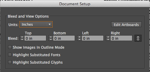
- Illustrator: If you followed the tutorial from Week 1, we established our poster with a bleed. You can still add one now if you didn’t. Just navigate to File > Document Setup and a pop-up (like the one below) will appear. From there add your bleed (you shouldn’t need anything more than 1.25 cm) on each side.
Adjusting your poster bleed in Illustrator - Inkscape: Click Extensions > Render > Layout > Printing Marks. In the pop-up menu make sure Crop Marks and Bleed Marks are checked, and then click the Positioning Tab. Here set your Crop Marks to the page size, and make sure your bleed has a margin of at least 1 cm outside your page, by adjusting the Bleed Margin. Click Apply, and you will see some printing marks all around your poster. Your printer professional should know how to interpret these marks.
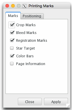
Creating crop and bleed marks in Inkscape
- Illustrator: If you followed the tutorial from Week 1, we established our poster with a bleed. You can still add one now if you didn’t. Just navigate to File > Document Setup and a pop-up (like the one below) will appear. From there add your bleed (you shouldn’t need anything more than 1.25 cm) on each side.
- Are your poster margins wide enough? That is, is there enough space between your poster content and where your poster will be cut? This is called your Safe Area. Printers will want at least 1.25 cm of space to properly trim your poster. You’ll want to make it larger (consider at least 2.5 cm) so it looks nice and clean. By now your poster is looking gorgeous, and if you’ve been following our advice, you’ll have much more space around the edge than this.
- Are your colors in the CMYK color space? Double check by:
- Illustrator: navigate to File > Document Color Mode and making sure CMYK is checked.
- Inkscape: navigate to File > Document Properties and under color add Generic CMYK Profile.
- Are your fonts large enough to read at a distance? Remember you should make sure the letters in your title are at least 2.5 cm in height. Your body font should be easily readable from a few feet away. To test this, print your poster on a single sheet of 8.5 x 11 in paper and read it at arm’s length. If you can read everything, your poster will read just fine.
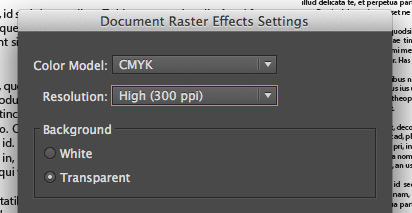
- Make sure your poster resolution is set at 300 DPI. This goes the same for raster images in your poster. To do this:
- Illustrator: navigate to Effect > Document Raster Effects Settings and make sure your document is set at 300 dpi.
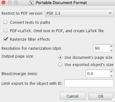
- Inkscape: You can do this when you save your poster for print. Navigate to File > Save As and select PDF from the Dialog window. Set your Resolution for Rasterization to 300 dpi.
- Illustrator: navigate to Effect > Document Raster Effects Settings and make sure your document is set at 300 dpi.
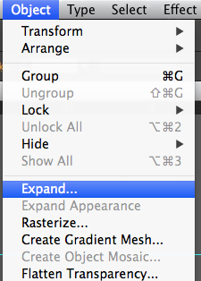
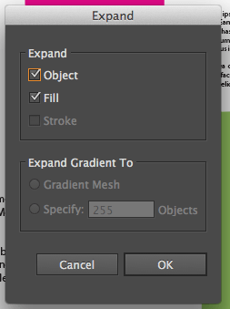
- Convert your text to vector objects. You will not be able to edit your text anymore so save this for last! We do this because your printer may not have the fonts you have used. If they need to make edits to your file, the fonts will be converted to what the computer thinks is a close match. To convert your text:
- Illustrator: Highlight all of you text and navigate to Object > Expand. In the pop-up window only select object and Fill as shown below.
- Inkscape: Again this can be done from the Save PDF Options (as shown in the previous step). Just click the “Convert texts to paths option.” Additionally, you can highlight all text in your poster, then navigate to Path > Object to Path.
- Illustrator: Highlight all of you text and navigate to Object > Expand. In the pop-up window only select object and Fill as shown below.
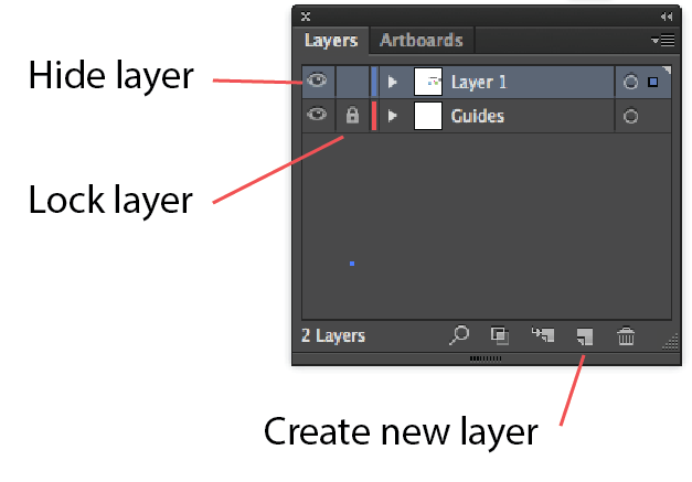
- Keep your guides as a separate layer and label it “Guides.” We haven’t talked much about layers. You’ll want to make your guides as a separate layer so the printer can easily distinguish your design from the guides (the guides shouldn’t print anyway, but this is good practice).
- In Illustrator: To create a separate guides layer and place your guides in that layer:
- Open the Layers Panel by navigating to Window > Layers.
- Using the image below as a guide, select the “Create new layer” button. A new layer named Layer 2 should be created. You can change the name, by double clicking where it says “Layer 2.”
- Now select all of your guides on your artboard and press Control+X (Windows) or Command+X (Mac) to cut the guides.
- In the Layers Panel select your Guide layer by clicking the circle to the right of the layer.
- Now simply press Control+F (Windows) or Command+F (Mac) to paste your guides exactly where they were previously, and in your guide layer.
- If you wish to know more about layers, this video will go into greater detail.
- In Inkscape: We’ve talked more about layers than the Inkscape peeps, but here is a bit more for you:
- Open the Layers Panel by navigating to Layer > Layers.
- Create a new layer by clicking the “+” icon. You can change the layer name by double clicking the layer name from the list.
- You can move items from one layer to another by right clicking the object and selecting “Move to layer…” and then selecting the layer you’d like this object to be in.
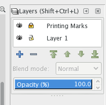
Layers Panel in Inkscape.
- In Illustrator: To create a separate guides layer and place your guides in that layer:
- Lock your design in the layers panel. As shown in the images above, you can lock a layer in place. This means that you can’t move or edit that layer, without first unlocking the layer. To lock/unlock a layer, just click the layer lock icon just left of the layer name.
- Save a copy of your poster as a PDF.
- Send to the printer.
- Ask for a proof. The printer will send you a digital proof of your poster as it would appear once it is printed. Look over everything carefully, one last time!
- Give the printer the go-ahead, hold your breath, and cover your eyes!
- Self high five.
We’ve also created an abbreviated form of this checklist for you to reference, print, and keep handy for future posters and print job.
With your poster complete, it is time to send your poster to print. Hopefully, you have one picked out. If not, many universities have a print shop that specializes in these types of prints. Fedex Office, Staples, and Office Depot (or OfficeMax) should also have printers that can handle academic poster sizes. The added benefits of these printers is that you can send the poster electronically to a location (say your conference is out of town) and not have to worry about transporting the poster to the conference on the plane.
If you have any questions about your design, or the print process, speak with your printer. They are generally very knowledgeable and should be able to point out any issues with your design. Having this dialogue is crucial to avoid making any costly assumptions on both your part and the printers. And having a basic knowledge of what the printer needs to know will make the process run smoother for you in the future.
Remember, once the poster is printed there is no going back.
Preparing for the Presentation
The big moment has arrived: poster session time!
What to wear

Particularly for those who are new to academic conferences, deciding what to wear can be challenging. There isn’t any need to obsess though, because the name of the game is simple: blend in. Whatever is the standard mode of dress at your conference is what you should aim for. Of course, the “standard mode” of dressing varies greatly across conferences. Ecologists are famous for wearing shorts and sandals at their meetings; medical and health types are much more likely to have ties and skirts.
How do you find out how people dress at the conference you are attending? Ask your colleagues who have attended that conference – or a similar conference – in the recent past.
Across conferences though, there is one hard and fast rule: wear comfortable footwear. After all, you will likely be standing by your poster for several hours.
How do you get people to show up at your poster?
One of the central points of this class is that the main purpose of the poster is to start conversations between you and the people you want to connect with. So, how do you get those people over to your poster?
A critical mistake is assuming that the people in your target audience are naturally going to wander by your poster. Conferences are busy places. Without external prodding, it is almost certain that most of your target audience won’t even be aware that your poster exists and will miss your poster session.
As a consequence, it is essential to inform the people in your target audience about your poster before your poster session. There are tons of great ways to get the word out.
- If there is a conference hashtag, tweet that you are giving your poster. In fact, tweet a lot about other stuff you see and do at the conference. People following conference tweets may like what you are doing, and stop by just to say hi.
- If people in your lab or other colleagues are giving talks at the conference, ask them to mention, during their talks, that your poster session is coming up. And vice versa, your colleagues will surely appreciate it if you mention their upcoming talks during your poster session.
- Ask your advisor or supervisor to bring up your poster session with his or her colleagues at the scientific meeting.
- Go to the talks and poster sessions of people in your target audience and directly mention your poster to them at an appropriate point.
- Make it easy for people that you meet at the conference to remember that your poster session is happening. To do this, make business cards that give the time and location of your poster session. You don’t have to get fancy business cards professionally produced at great expense. Instead, design a very simple card and print it out on your own printer, using business card paper. You can buy this at most standard stationery stores.
- Most importantly: talk to people! It can be intimidating to talk to researchers you don’t personally know, particularly those who are eminent in your field. But remember, everyone comes to conferences for the express purpose of talking to people. Why shouldn’t they talk to you? It is the experience of all the instructors of this class (who have cumulatively spent 30 zillion man-hours in conferences) that people at scientific meetings are generally quite approachable.
Two factors play a big role in determining how much work you’ll need to put into getting people to show up at your poster session. First, the bigger the conference, the more work you’ll need to do. At conferences that draw several thousand people, there is a bewildering array of activities planned for every moment. Consequently, the chances that your target audience will not know about your poster session are exceptionally high. Further, the number of posters at a given poster session is usually much greater at big conferences, requiring effort to cut through the clutter in even your own poster session.
However, even at small conferences, it makes sense to get the word out. After all, even if there are not alternative sessions at the time of your poster session, people always have the option of skipping it to catch up on e-mail or to get some coffee.
Here’s the second factor: is the subject of your overall poster session of general interest to the audience that you want to connect with? If your session’s subject is unlikely to naturally draw your target audience, you’ll need to put in some extra effort to get those folks to show up at your particular poster.
Bring supplies!
When you are in hour three of your poster session, you want to be focussed on the people at your poster – not on how hungry you are. Bring some snacks and some water for yourself so that you can stay sharp.
Presenting Your Poster
There is much more to a poster presentation than standing next to your board and answering questions. The hallways in a poster session can be very busy and dynamic. Some people will be looking for specific posters and others will be browsing for whatever poster catches their fancy. Poster sessions demand you pay attention to a lot of things happening around you all at once.
Stand next to your poster when possible rather than sitting. Standing makes you more visible and serves as a cue that you are ready, willing, and able to talk about your poster.
Watch for people who are on the margins of your poster – particularly if you are already in conversation. It is very easy to so deep into conversation that you miss or ignore someone who wants to talk to you about your poster. Be willing to put the brakes on your current conversation to say, “Hi, I’ll be right with you” to someone who is looking at your poster. Try to acknowledge everyone, and create a space where that person can engage with you.
If someone comes up to your poster and starts reading, do not launch into them with the full story of your research, or even your elevator pitch. Ask them, “Would you like a tour of the poster?” Some people might just want to read. Others will look relieved, and say, “Yes please, tell me about your work.” Different people want different levels of engagement.
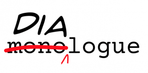
While a stock elevator pitch of your poster is a good icebreaker, remember that a poster is there to start conversations. Let the other person talk. Ask the other person if their research interests are similar. Watch for clues that the person you’re talking to might want to ask a question – say, you get a puzzled look when you explain figure 2, or eyes glaze over when you hit the third differential equation.
Think dialogue, not monologue.
Tablets are a great way of showing material that doesn’t work well on paper, like videos. Laptops are just a little bit too clunky for a crowded poster session. And showing a video on a tablet is a great way to attract passers-by, who will stop just long enough to see what the video is.
It’s valuable to be able to leave physical traces of your presentation. There are at least three things that you can take with you:
- Business cards. Classic, simple, portable.
- Small handout sized versions of the poster. If your poster passes the arm’s length test, you don’t have to do any more work than printing out the poster on your desktop printer.
- Reprints of related work. You may not have this if you’re just starting, but quite often a project will be a continuation of earlier work in the lab. This can be better than emailing someone a PDF, because people might be looking for something to read in the airport or the plane on their way home.
Likewise, it can’t hurt for you to collect business cards so you can Google stalk people after the conference, and figure out who you want to follow on Twitter after the conference.
What’s Next?
You have presented your poster to much fanfair. That doesn’t mean your poster’s life is over. In fact, many posters get a second life. Many labs, departments, and centers will hang posters on the wall. Some of them may even frame them, depending on the budget available. Speak with your PI or administration about acquiring wall space and assistance with hanging your poster. Now that your poster is a beautiful piece of scientific art, it’ll look great in a public space, and you’ll be sure to get lots of compliments from your colleagues!
Your poster can also have a digital life. There are many platforms available that will store host your poster. Our favorites are slideshare.net and figshare. Both sites will host your poster for free, track views and visitors, enable downloading, and allow you to embed the poster in other web sites (perfect for your lab page, or your online CV). To upload to either site, you’ll want to have a PDF version of your poster.
Slideshare is more like the Youtube of presentations, and will give your poster a much wider audience. This is a great option for those of you who wish to communicate with audiences not present at your conference. You can see the Open Notebook Science poster we’ve used so much as an example on slideshare.
figshare on the other hand is designed for an academic audience. The platform gives you the added benefit of making your poster citable and will provide a DOI. Here is the citation for the ONS poster via figshare:
Salvagno, Anthony (2012): Open Notebook Science – SACNAS Poster. figshare.
http://dx.doi.org/10.6084/m9.figshare.96326
Retrieved 18:17, Jul 02, 2015 (GMT)
By default your poster will be given a CC-BY license, which allows others to share your research provided they give proper attribution. figshare is set up for archival purposes, so you can be assured that your poster will exist, digitally, for as long as you want it to.
If you upload your poster online, you can also point your poster visitors to its online location. This would give you a great reason to give them your business card (with the poster’s online location), and give your visitors a more-than-lasting impression.
Assignments
This week we have several tasks for you.
- Make your final adjustments to your poster and upload it to the class Google+ page. When you post the poster, please mention
- Your intended audience
- Your take-home message
- Let’s practice actually giving our elevator pitch to another person at your poster session. To do this we are going to use Google Hangouts, but in a different way. This week you will pair up with another person in the class. Use the Spreadsheet linked in the Google+ Community under Week 5 instructions, to share contact information and schedule a time to chat via Hangouts. In the meantime, prepare your elevator pitch. Once it is time for the hangout:
- Give your elevator pitch to your partner. Remember to keep this short. A traditional elevator pitch is 30 seconds long (about the time you’d have in the elevator with someone). At a conference, you’ll have a bit more attention than that, but aim for less than 2 minutes.
- Practice using this as an opportunity to begin a dialogue with your partner about your poster. If you want/need to, use the screenshare function of the hangout to show your poster from your computer. Not only is this a good time to practice your networking skills, but this is a great way to learn about all the amazing research we are all doing.
- Provide some final feedback to your partner to help them perfect their elevator pitch and their poster. Your feedback should be aimed to help your partner stay on track. If the audience isn’t interested in the long version, then the elevator pitch is the one chance to get the take home message out.
- Does your partner clearly communicate their take home message?
- Is it appropriate for their intended audience?
- Does that message draw you in?
- Did they stay within the time limit (2 min)?
- Please provide feedback for at least three other posters. In your feedback, be sure to answer the following two questions:
- Does the main message come through loud and clear?
- Is that main message likely to draw in the intended audience? If not, how could it be tweaked?
- Sign up for an instructor led group hangout. This is the last one of the class! If you need any specific poster technical assistance, contact Anthony (anthony@scifund.org) to schedule a private help session hangout.