
Welcome to Week Three of the 2015 SciFund Challenge Poster Class! This week, our focus is on our figures.
Last week we spoke about how the layout of your poster can affect the narrative of that poster. In fact, every element of the poster can either add or detract from that narrative. In previous weeks of this class, we have stressed how important the Message Box can be in keeping you on target. The main job of the Message Box is to keep you on point at all times, and to help you minimize potential distractions and detractions from your poster narrative.
The same is most definitely true for the figures on your poster (your data plots, illustrations, photos, and other images). When incorporating a figure into your poster there are two key things to ask yourself: (1) how does this reinforce the message of the poster, and (2) what is the message of this individual picture?
As you develop the pictures on your poster, you’ll need to keep constantly asking yourself these questions. You’ll come to find that the context of a picture in relation to your poster may change as your poster becomes more developed. It may make sense to include a specific figure right now, but you may find later that figure choice may not be the right choice.
Does a figure make sense on your poster? The easiest way to make that distinction is to determine if the figure in question exhibits good figure design principles. What constitutes good figure design? Glad you asked!
The principles of good data display
Let’s face it. The figures are the poster’s main attraction. Posters that can’t showcase a good figure will be overlooked. Similarly, the same is true for a poster that has too many figures with no clear distinction amongst them. A great figure (or a few) will ultimately entice a poster session visitor to inspect closer.
It is important to remember that good design always keeps the needs of the user at the forefront. In a poster session, your audience will only be at your poster for a short time, so figures need to communicate information quickly. Fail, and your visitor may walk away.
Because of this, you may not want to use a figure prepared for a journal article for your poster. There are more leniencies for figures in journals, because the reader will have an unlimited amount of time to understand the data. Additionally, if you are preparing a new figure you will not want to create it as you would a journal figure, for the same reasons. The three figures below demonstrates the process of adjusting a figure from journal ready to poster ready.
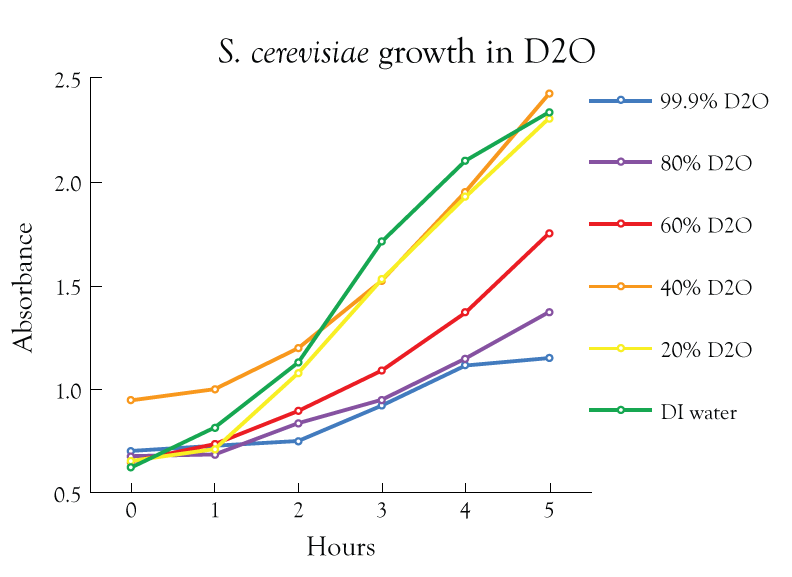
The above figure was prepared for Anthony’s dissertation. Because it is designed to be consumed at the pace of the reader, there is more visual information to absorb. The objective of the figure is to illustrate the effect that water-type has on yeast growth. For poster display, it is more important to show the differences between the most extreme water types (normal H2O vs D2O).
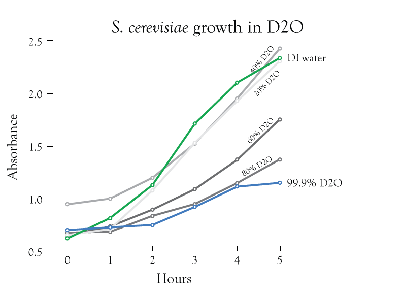
In the above figure, the color usage was reduced to eliminate a lot of the visual distraction, which detracts from the main idea. But let’s go even further…
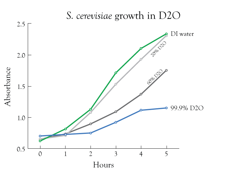
In this last version of the figure image (just above), some data was removed to again eliminate distraction. Now compare the first and last versions of the figure. Notice how much simpler the last figure is and how quickly the main point of emphasis jumps out at you.
Now this isn’t to say that complex data display should be avoided in a poster. Not every dataset is as inherently simple as a line graph. For instance, protein folding is a complicated process, but protein structures are intuitive. When you look at one, you instantly get a sense for the shape and complexity of the protein.

Another great example is this demonstration of the evolution of patterns of conus shells, as seen below.
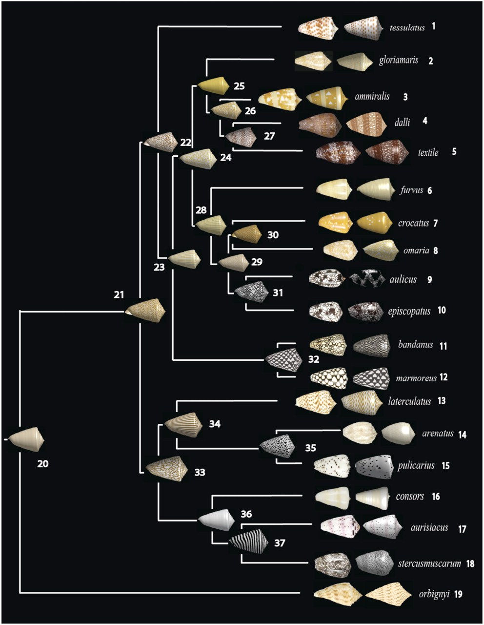
Shapes and patterns are easy for our brain to understand and recognize. Additionally, the tree-structure of the figure provides a sense of hierarchy, which implies a time aspect. Thus, we are able to quickly understand what this figure is trying to convey.
The secrets of good figures
It’s easy enough to look at examples of good data display, but how can you ensure that you develop good figure making habits? Here are a few rules to understand:
Eliminate Chartjunk. If you throw out everything that is non-essential in a figure, a viewer will be able to interpret that figure more quickly and more easily. The bottom line is that an “essentials-only figure” is more compelling to viewers.
Chartjunk can be thought of as all the fluff in a figure that is non-essential. Think of cross-hatching, 3D shapes, excessive grid lines, drop shadows, or basically any effect you can generate in Excel. The data is the focus of a figure, and chartjunk just helps to remove that focus. Try to relate every element of your figure to the message of your figure. If an element doesn’t convey that message, then remove it.
For example, compare the two figures below which contain the same date. The first figure is purposely designed with maximum chartjunk, while the second is as simple as possible.
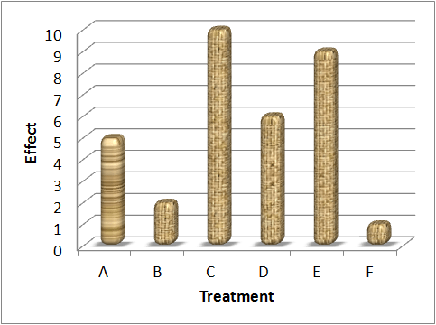
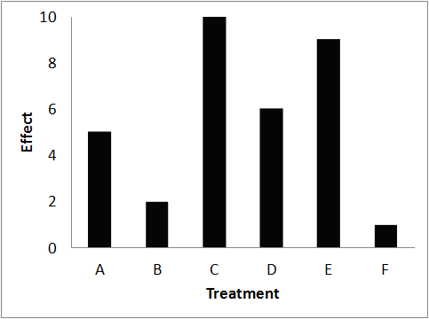
Notice how the second image is much simpler to read. The lack of distraction allows you to get right to the heart of the data and better gauge differences in the chart.
Maximize your data-to-ink ratio. This is an idea popularized by the famous data-design theorist Edward Tufte and is a way to maximize the impact of your data. Here’s how it goes. Imagine printer ink is an extremely expensive and rare resource. You are given a very limited amount to make a figure for your data. In order to best use your precious commodity, you will need to carefully plan its use. With this in mind, you’ll want to use most of the ink to make sure the data is well represented. In other words, you don’t have any ink to spare on non-essential design. In the design world a minimalist approach provides the largest impact, which is exactly what you want for your poster.
One obvious way to maximize your data-to-ink ratio is to throw out chartjunk. But you can probably go further. Can you replot your figures in a way that cranks the data to ink ratio even higher?
Revise and edit. Take the time to analyze your figure. Try to remove elements you think are unimportant, take a step back, and look at it. Is the figure easier to understand or more difficult? Go back and try again. Ask others how they interpret your figure and use that feedback to improve your figure. Figure design is an iterative process. You aren’t going to get it right on the first try.
Provide context. A good figure gets right to the point and paints a clear picture, but it still needs context. The best context provider is a short caption. The image can only present so much, and sometimes you just need to use words. So use them!
There are a lot of great figures and images that convey scientific information, so learn from them. The Visual Display of Quantitative Information by Edward Tufte is a great resource for data display. Also if you want examples of what not to do, see this page hosted by the University of Wisconsin-Madison.
Technical aspects of figures
There are two kinds of images that you might use on your poster. There are bitmap images and there are vector images, and there are important difference between the two that are useful considerations when considering figures for your poster.
Bitmapped, or raster, images use pixels. Your digital camera makes pictures using pixels, and so do most images you see on the Internet. The *.jpg, *.png, *.gif, and *.tif file extensions are all pixel-based images. Because they are images made with dots, as you enlarge the image, you will reach a point where you can see the individual pixels, and the image will look jagged. Viewers do not like this.
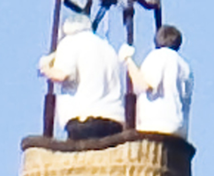
Here’s an example of a raster-based image, using this hot air balloon:

If we zoom in on the people in the hot air basket, you can clearly see the jagged, individual pixels.
If you have a pixel-based image, you need to know:
- How many pixels make up the image. High resolution images from current smartphones might be 2560 by 1920 pixels.
- How big the image will be printed on the final poster. A picture might be 10 inches across, for example.
Divide the number of pixels by the final size to arrive at a “dots per inch” (DPI) value. The higher the value, the better (up to a point). For example, the full resolution of the hot air balloon image used above is 4212 by 2788 pixels. If you want the final image to print at 10 inches across you need to make sure the printed resolution will not be pixelated. Just divide your pixels by the length dimension to get pixels per inch (or dots per inch). In this case the horizontal resolution is 421.2 dots per inch. Since our posters should be set at 300 DPI (we did this in week 1) your image shouldn’t experience any pixelation.
For comparison, 150 DPI is about the resolution of a printed newspaper, and a desktop computer screen is 96 DPI. Good quality print standards are 300 DPI, which is why we set our posters to this resolution in week 1. Aim for 300 dpi for your images.
On the other end of the image spectrum are vector images.
Vector images represent the image mathematically. The *.wmf, *.emf, *.svg, *.eps, and *.ai formats are all vector formats. These are superb for representing geometric shapes, like graphs. Their big advantage is that they will scale to any size. Because they are not made from pixels, they can never be pixelated.
Let’s see an example again, with another hot air balloon image (the original is vector-based):

If we zoom in on the people in the basket, you can see the curves still look smooth:

Your best bet? Use vector-based images when you can.
Any photo that you use in your poster will be a raster-based image. With your data plots and illustrations though, it’s a different story. The program that you used to create those images will very likely give you the option of saving the image in either a raster-based file format or a vector-based file format (choose the latter).
Adobe Illustrator creates vector-based images, but it does not turn pixel-images into vector images automatically. If you import raster-based images into Illustrator, they’ll stay that way (there are methods in Illustrator to convert raster to vector images, but they are outside the bounds of this class).
Creating compelling raster-based figures
The most likely raster-based figures that you’ll have in your poster are photographs. There’s an easy way to make your photos more compelling, known as the rule of thirds.
The rule of thirds: Beginning photographers tend to put their subjects in the exact middle of the frame. However, pictures often look more interesting if the subject is not centered. Having the focal point a third of the way from the edge (top or bottom) is considered the “sweet spot” by many professional photographers. Take a look at this great example, where the hawk is aligned with the right grid line, while the top of the grass (the horizon) is aligned with the bottom grid:

You don’t even need to retake an image to make it more interesting. You can simply crop the image and align the subject (the image focal point) with the imaginary grid.
You can find a lot more about how the rule of thirds can help you take much more compelling photographs in this blog post by Anthony.
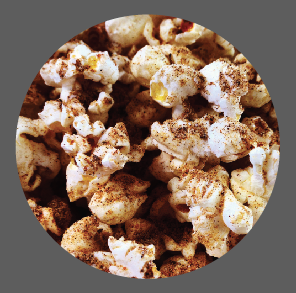
Contrast: It would require an entire other class to talk about all of the things you can do to enhance your photos. But one of the most important things to do is to make sure your photos are high contrast (and this will apply to everything else on your poster as well). Remember the image of the hawk above? Notice how it clearly stands out from the background, even though the colors are similar. That difference is due to contrast. Below is a before and after image of popcorn, taken by Anthony:
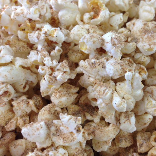
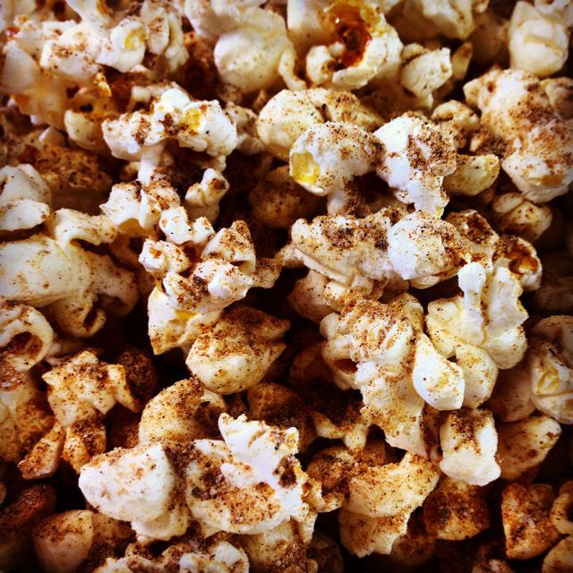
The first image is the original, and the second image has been manipulated a bit to exaggerate the contrast. Notice how it is much easier to see the texture of the popcorn and the seasoning.
Raster resizing: Many pictures may not fit into the space you you have allocated on your poster. If so, crop them (that is cut away the sections you don’t want); do NOT stretch them. Besides looking like the image is being seen in a funhouse mirror, stretching scientific images starts to push into data falsification. Proportions can matter!
Because Illustrator is not mainly a package for working with pixel-based images, it may be easier to manipulate images outside of Illustrator. Adobe Photoshop can do this, as well as web tools like Pixlr and the open-source free software Gimp. Additionally, apps like iPhoto and Picasa have basic photo manipulation capabilities as well, and they have the added benefit of being very simple to use.
Using colors
Include the color blind. By several estimates, about 5% of the population (mostly men) are color blind. The inability to tell red from green is the most common form of color blindness.
The fastest way to make sure that everyone can see your images is to use black and white, or shades of gray. This can be a little uninteresting, so other high-contrast color combinations can work. A quick way to test if your image is color-blind-friendly is to save it as a grayscale image (no colors other than black, white, and shades of gray) and then see if the image still makes sense. If the image still works, then your colors pass!
You can use shapes in addition to colors to distinguish data points. For example, instead of using red dots and green dots on a scatterplot, use red dots and green triangles. But remember to use this within reason. If you can distinguish points without adding shapes then don’t. You don’t want to fall into the chartjunk trap!
Using figures that you did not originally create
Using figures from journal articles. If you want to include a figure from a journal article, it can be worth redrawing the figure. This lets you make sure the old image is consistent with the rest of your poster (typeface, color, size, etc.) and is legible enough for a poster. There are tools, like Data Thief, that allow you to turn graphs into data that you can then replot.
Using images from others. Even though most people have smartphones that can take high resolution images, sometimes people will turn to the web to find pictures rather than generating their own. Taking your own pictures has many advantages. There are no copyright issues, and by definition, they will be images that nobody has seen before. Further, you can use the rule of thirds (see above in these instructions) to make the images especially compelling.
However, there are times when you do not have the images that you need. What to do? Many people, when looking for images, go straight to Google. Google image search is a wonderful resource, but many images are intended for the low-resolution 96 DPI of many computer screens. They do not have enough pixels to look good reproduced in large format on a poster.
You can use the “Search tools” option in Google images to look for particular sizes. In general, you want to look for “Large”.
Photo sharing sites, like Flickr, tend to offer higher resolution images than Google images.
Images on the web are not necessarily free to use; they may be copyrighted. Again, Google Image search and Flickr both allow you to specify to search for particular reuse options, such as Creative Commons licenses.
We covered at length the issue of copyright and how to find great images in the Video for Scientists class we taught last fall. In these instructions for the previous class, check out the top two sections: “Using other people’s stuff in your video” and “Finding Creative Commons images”.
Figure modification in Illustrator
As mentioned before, it is important to know if the file you have is in vector format or raster. If you have a raster image (PNG, JPG, GIF, BMP, etc) you won’t be able to do much with that image in a vector graphics software like Illustrator. Additionally, you will have to take special care to avoid distortions when you manipulate it in your poster. Sometimes though there is no workaround (photos for instance).
But if you have a vector image, you will be able to scale and edit just about every aspect of your image. Many data manipulation tools will even allow you to export your figure as a vector file format. Most likely you’ll have the option of exporting in SVG or EPS file formats, and in some cases exporting in the PDF format will give you the desired result.
Once you have your vector image, you’ll be able to:
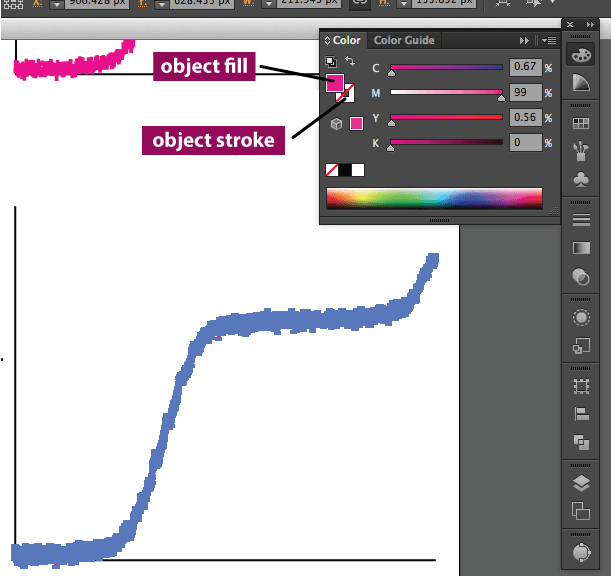
Change color. Every path in illustrator (shapes, lines, etc) consist of a fill and a stroke. The stroke is the outline of an object. In the case of a line, the stroke is what gives the line color. The fill is the entire internal area. Lines do not have fills, but open paths (incomplete shapes) will attempt to create one. From the Color panel (to open navigate to Window > Color) you’ll be able to edit the color of both of these just by using the sliders in the Color panel. See below for a reference.
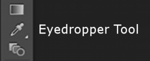
Copy colors. If you have a strong, central image, you might want to echo the colors in that image throughout the poster. You can copy colors using the Eyedropper Tool (Illustrator keyboard shortcut = I), and then apply that to other elements in the poster. All you need to do is select the object you wish to change the color of, select the Eyedropper tool, and then click the color or object whose colors you wish to use. You can even apply these colors to your vector-plots.
Aside about color: We will spend much more time talking about color palettes next week. So don’t get too hung up on colors just yet. Feel free to experiment with colors and the Illustrator tools, but don’t set your heart on using specific colors just yet. You may learn that your color choices just aren’t working from a reader experience perspective.
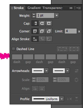
Adjust lines. With complete control it is very easy to add/remove lines from a figure. Just select and press Delete to remove a line. You’ll also be able to adjust the properties of the line using the Stroke panel (Window > Stroke). You can change the line thickness by adjusting the Weight, turn it into a dashed line and adjust the spacing between the dashes, and create rounded ends and corners. Here is what the Stroke panel looks like:
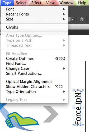
Edit text and font. We’ve already done a little bit with text so far, so you should be getting used to the Type Tool in Illustrator. There is also a Type Menu that allows you to manipulate type in a few other ways. Glyphs allow you to pick special characters and symbols. You can also quickly change the case (Change Case) for selected text, and orient your text how you’d like (Type Orientation).
There is one noteworthy thing you can do with photos in Illustrator. You can crop images in a very specific way if you use Clipping Masks. Here is how:
Place your image. We haven’t put images into our Illustrator poster files yet, for two very important reasons. First, when you place an image file, the image is tied to a location on your hard drive. Move the image and Illustrator can no longer find the image and it will not display properly. Second, once you place an image, the file size of your poster Illustrator file will increase dramatically. So a word of advice: if at all possible, save these steps for your final week.
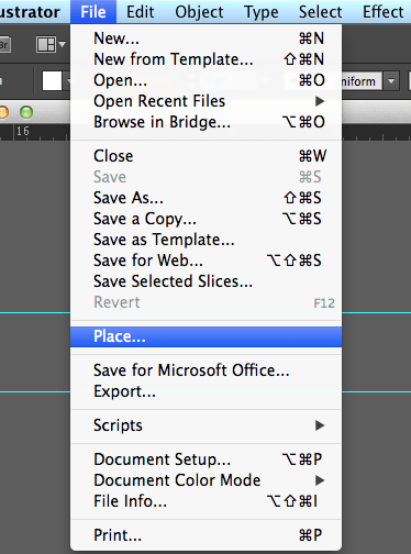
Now that we have that out of the way let’s insert an image into Illustrator. In Illustrator, navigate to File > Place. Then select the file you wish to put in your poster.
Now you have placed an image in your poster.
Clipping Mask. Now I want to give my placed image a circular shape. I’ll use the image of the popcorn from earlier as an example.
First create a circle (use the Circle tool and click and drag with Shift pressed to constrain the proportions to a circle). Make sure the circle is in front of the image. To make the circle the foremost object right click it and navigate to Arrange > Bring to Front (you can also press Command+Shift+] for Macs or Control+Shift+] for PC).
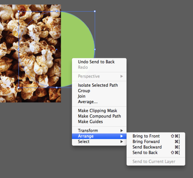
Next align the circle as you’d like in front of your image. Select both objects (your circle and the image), then right-click and navigate to Make Clipping Mask (you can also press Command+7 on Macs or Control+7 on PC).
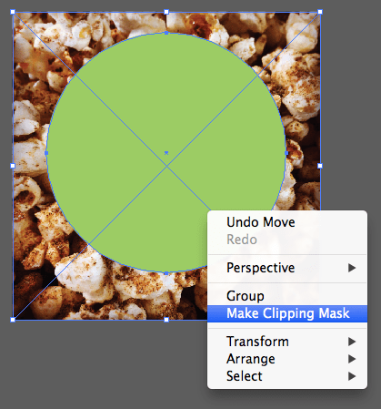
That’s it! Your image should be the shape that you created. Remember the shape you want your image to be MUST be in front of your image.
Assignments
- Gather your figures and images. Select your absolute best and make sure that they fit your poster narrative. Make sure your figures fit the guidelines highlighted in this post. If they don’t, edit them so that they are easy for others to process in the short time you’ll be presenting them. Remember to:
- Maximize the data-ink ratio
- Remove chartjunk
- Revise and edit (also see step 4)
- Upload your figures and your wireframe (separately) to Google+ under Week 3 Assignments. You can upload multiple images to one post in Google+.
- Update your wireframe to indicate which figure goes where.
- If you choose to Place your images into your wireframe, still upload your figures individually so we can see them in all their glory.
- If your figures are vector based, you can open them in Illustrator and Copy and Paste them into your poster file. If you go this route, it is a good idea to edit them first in their original file and then copy+paste the final version into your poster.
- Provide feedback on 3 other class member’s figures. Here are some things to look for:
- Is the take home message easy to determine?
- Are there any distracting elements?
- Can this be presented in a simpler fashion?
- Revise your figures. As you work through your poster you’ll need to revise your text, remove figures, resize them, etc. You aren’t done with your figures until the very end and you may go through several revisions before an image is poster ready. Take your time with this step. You’ll have the whole rest of the class to get this right. Just make sure that you incorporate the feedback you receive into your figures. If someone in the class misreads your data, you will save yourself the time now by clearing it up before it is printed and uneditable.