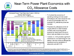
As a scientist, more than likely, you’ve given at least one presentation about your research and you’ve seen you’re fair share of presentations as well. Unfortunately, many of those presentations were full of slides that looked like this:

Many scientists easily lose sight of their message, or fail to realize that their message is hidden in a sea of noise. To prevent you from falling into the same trap here are some helpful tips on how to create a presentation that is both interesting and powerful. After all, your message is just as important as the ones promoted by TED and Ignite speakers, so why not present it as such?
Rule 1: Keep it simple.
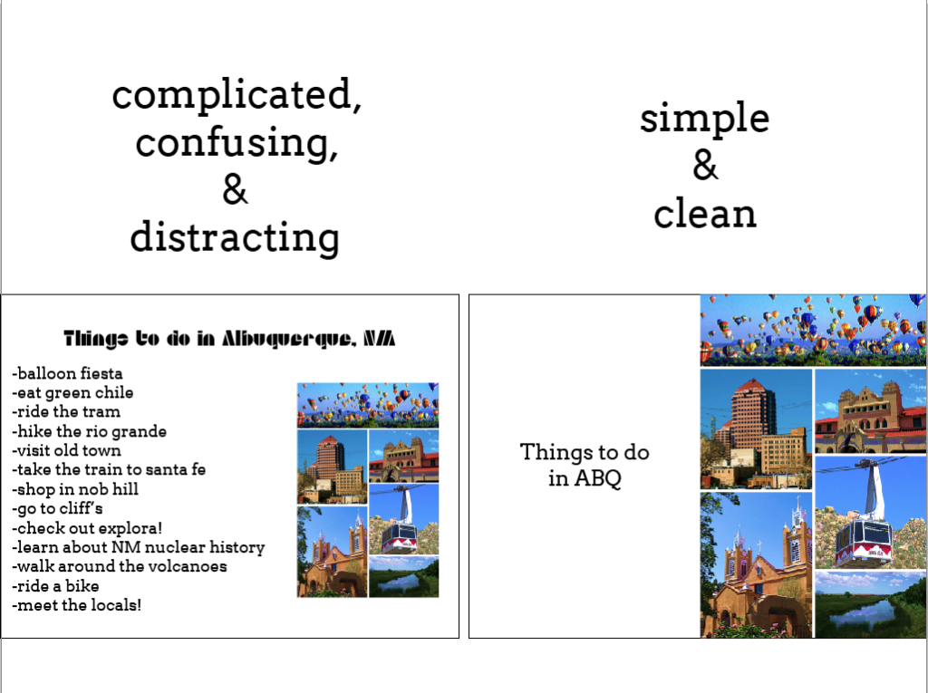
This is the easiest rule to remember and the hardest rule to follow. When designing presentations break down each slide into ideas/concepts and use only 1 idea per slide. You may end up with 3 times as many slides in the end, but you’ll go through them faster (Ignite style!), and slides are free after all. If you have an image, don’t put the image on the same slide as a bunch of text. Minimize the text and blow up the picture. The more information there is on a slide, the less your audience will remember and the less likely your audience is paying attention to what you have to say. Below is an example of two slides that relay the same message: fun things to do in Albuquerque.

As you can see, the slide on the right relays the same message but shows it with a much larger image while the presenter presumably explains how fun Albuquerque is to visit. You may think that this is more difficult with scientific information, but trust me it isn’t. The key is to know the information well enough to explain it without needing words on the slide like a crutch. When showing data, simply show a graph of your data and nothing else. After all, no one knows your data like you do, and your audience should get that information directly from you rather than reading it from a bright wall.
Rule 2: Know your audience.
I bet you’re sick of hearing this. Unfortunately it never stops being true, and when it comes to presenting knowing who you are presenting to before show time can help you focus on the task at hand: sharing your message in a time delicate manner. If you are speaking to a diverse audience, make it so that everyone can understand the key points in your presentation. If you are speaking to your lab mates, you have the flexibility to go into great detail. If you are presenting to your peers, you can will probably need to find the middle ground. This is particularly important because you never know who is in your audience and who may be impacted by your presentation. If there is someone in the audience who can help you in your mission, they need to be able to understand your message, otherwise you’ll have missed an extremely valuable opportunity.
Rule 3: Practice.
You think Steve Jobs woke up one morning and said, “I think I’ll promote the iPhone today.” Heck no! He picked a date far in advance, prepared a killer presentation, and then practiced constantly until show time. You probably aren’t going to be delivering a speech that will entice millions of people to spend millions of dollars on a single device (but if you are good for you!), but your message isn’t any less important. After all, you are spending a lot of time to learn everything you can about a particular system, species, etc and you are excited about your research. So why not show your audience how excited you are and why not put in the time and effort to relay how important your work is to yourself. If you don’t care, neither will your audience.
An extreme case of miscommunication.
There are lots of other little things you can do to make an impactful presentation. Proper design is a large part of that, and before this week is out I’ll share some simple design tips to make your presentation stand out from the rest. But before that let me share with you a story of miscommunication. In this story, having a clearer presentation of a particular message could have saved lives.
In January of 2003, the space shuttle Columbia took off and a little over a minute into the flight a piece of insulation fell off and hit the wing of the shuttle. 2 weeks later Columbia returned from space only to burn up in the atmosphere upon reentry. Everyone on board was killed.
It turns out that NASA engineers were aware of the liftoff malfunction and were hard at work trying to remedy the situation. They gave a presentation that showed inconsistent and inconclusive data, but still gave the go ahead to return to Earth. While I won’t go into the ethics of presenting accurate, consistent, and conclusive data, I will say that they could have simply presented their message clearer and a much better decision could have been made. Why they decided to allow the shuttle to return instead of delay a little longer is beyond me.
And sadly this isn’t even the first time this has happened at NASA.
I’m not trying to blame NASA for this incident, but merely trying to highlight the power of a good presentation and a bad one. In this case, a good one could have saved lives. For more on the Columbia disaster as it relates to presentations, check out Edward Tufte’s website. And learn more about the ethics involved in the Challenger disaster at OnlineEthics.org.
Hopefully you will never be in this position, but do yourself a favor anyway and give the best possible presentation you can!


2 comments on “The importance of presenting your message”Add yours →
Comments are closed. You can not add new comments.