
More tasty analysis!
First, how did round 3 compare to the previous rounds in how ambitious the researchers were? People were asking for more money than in Round 3 than 2:
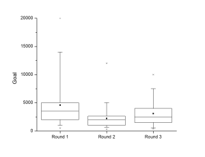 (A reminder of how to read these graphs: the small black square is the mean. The box shows where 50% of the values fall, and the line dividing the box in two is the median. The whiskers show where 95% of the data is, and the little stars show the biggest and smallest values.)
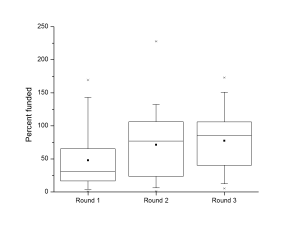
Jarrett already showed that the total number of dollars each project raised is up this round, but I think the amount raised in terms of the percentage of the goal is even more striking in showing the growth of #SciFund:
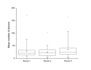
 How did projects do it? Projects were getting slightly more donors in this round than before, but it’s just a very slight nudge upward:
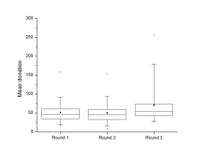
And, on average, each donor was tending to give a little more than in the previous rounds. Again, it’s not big, but that’s the trend across all projects, shown by the box creeping up the graph, and not just the whiskers getting longer.
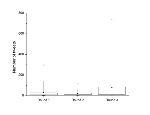
 One of the things that caught me off guard was the change in the social media stats I pulled from RocketHub. Compared to Round 2, I would have sword that there was a lot less chatter going on that was tagged with the #SciFund hashtag than round 2. But the stats show a difference story. People were tweeting about their favourite projects much more than in previous rounds, but apparently were not using the #SciFund hashtag. Much of the sharing was “dark”, or at least tricky to find if you weren’t specifically looking for information about specific projects.
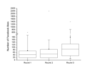
 Facebook is harder to get an impression of what’s going on, since it is not as quickly searchable as Twitter. The story from there is much like Twitter, and the number of “Likes” for projects was up, though maybe not as obviously as for Twitter. (Note this one has breaks in the Y axis because of the crazy outliers).
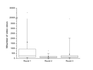
Finally, the video views for projects… I can’t make head nor tail of. We had an almost viral hit with Diane Kelley’s “Force of Duck” video in round 1. (That’s the ridiculous outlier causing me to break the Y-axis.) In general, people were watching the videos in round 1 much more. Watching the project videos almost collapsed in round 2, and showed a tiny little bump back up in round 3. Again, however, a lot of that was due to a few (three) videos.
 If you want to play with the data yourself, all three rounds are available on Figshare!
- SciFund Success and Social Media. Open Science Federation, Jarrett Byrnes, Zen Faulkes, Jai Ranganathan, Open Science. figshare. http://dx.doi.org/10.6084/m9.figshare.90818
- #SciFund Round 2 success and social media. Zen Faulkes. figshare. http://dx.doi.org/10.6084/m9.figshare.92541
- #SciFund Round 3 success and social media. Zen Faulkes. figshare. http://dx.doi.org/10.6084/m9.figshare.104620

1 comment on “SciFund in 3 rounds, part 2: box plot fever”Add yours →
Comments are closed. You can not add new comments.