#SciFund Challenge Class
Part 9: Final Tweaks to Your Poster
Now that all of the major poster content is complete (or near completion) we can focus on basic style modifications that can make a big visual impact. One of the easiest and most common additions to a poster will be the addition of a background.
Poster Background Design
A poorly done background, will RUIN your poster. If you can’t figure out how to make it work, don’t include one. It’s just not worth it. Black text on a white background is a classic look that will never go out of style.
But if you want to experiment, we have a couple of suggestions for you.
Using a photo
We’ve talked about image quality earlier in this guide. If you are going to use a photo as your background, it better be a high resolution photo. If you stretch a low res photo, you will end up with a very pixelated and distracting image that will only detract from your poster presentation. You’ve worked hard to have a compelling and beautiful poster, don’t get lazy now!
If you do have a high res photo, make sure that it does not interfere with your text and ruin your poster contrast. Check out this poster shared by Emily Austen at a recent conference:
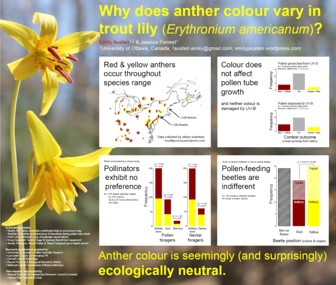
The background is very subject oriented, and the subject just so happens to be the flower in question. Notice the very shallow depth of field of the image, so the entire background is out of focus. This keeps attention on the data. Additionally, the flower color scheme plays an important role in the poster itself. Emily further distinguishes her data by creating white boxes that surround her data.
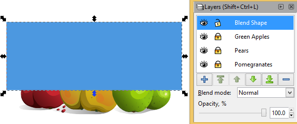
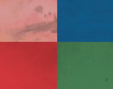
Another helpful technique is to manipulate the opacity of an image, or object. In Illustrator you can do this via the Transparency Panel, while in Inkscape this can be achieved with the Fill and Stroke Panel, or in the Layers Panel. By manipulating an object’s opacity, you can lighten, or darken, your photo depending on the object/color behind it. If the only color under your photo is the white artboard (which will also be your paper color), then your photo will be lightened. It will almost have a bleached effect. If you have a black background behind your photo your photo will be darkened.
![]()
Since text is by default black and you’ve probably gone that route as well, lightening a photo drastically will give you that same level of contrast. If you’ve gone with white text, you’ll want to darken the photo.
Creating a simple background with pizzazz
You can also choose to keep your background simple. If you’ve created a poster color palette you can use one of your palette colors (preferably the lightest or darkest to contrast your text color) to create a simple background.
You can also give that color some texture in a very simple way and it works similar to the transparency method above. But first you’ll need some textures.
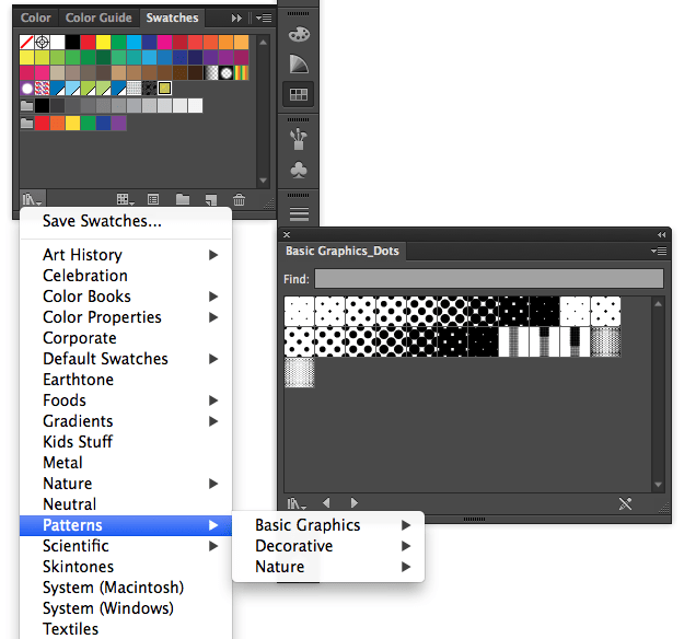
Textures are raster images of basically nothing. They can be ink blotches, watercolor paintings, textured paper scans, etc. This list has some great textures you can work with. Like working with photos, you’ll want these image files to be high resolutions. But even pixelation in this case may not be a bad thing. The pixelation may give you a cool result once you apply some transparency effects to it.
![]()
To create a textured effect in your design, first place your image into your design file (Illustrator:File > Place, Inkscape: File > Import). Many textures are colored so you could (in theory) just place your texture, stretch it to the size of your bleed marks (remember this?), move it to the background (using the layers panel, see below for more details) and then change the opacity to get a lightened textured effect.
The fun begins when you add a colored object behind the texture. The simplest thing to do would be to create a rectangle the exact dimensions of your texture image. Pick your top object (which should be your texture image) and use the dropdown box (where it says “Normal”) to mess with the transparency properties of the texture. Experiment with all the options and pick the effect you like the best and works well with your poster design.
You can maintain this effect and make it a bit more subtle by adjusting the opacity. Try a number in the 10-30% range to give a slight hint of texture in the background. Remember we want alluring, not distracting.
Patterns in Illustrator
In Adobe Illustrator, you can also generate patterns quickly using the Swatches Panel, which we introduced you to last week. You can use the preloaded patterns which are loaded in the Swatches Library (see the image below). Just select any vector object and click a pattern swatch. The object will then be filled with the pattern.
You can even try to make your own pattern or download a free pattern to use. This site has a list of hundreds of patterns you can implement. To make your own pattern you’ll need a bunch of objects. Just select the objects comprise your pattern and then drag them into the swatches panel like you would to make a color swatch. Now you can apply that pattern to any object. If you’d like to make your own pattern, this video tutorial may be helpful. If you have Illustrator CS6 or above, there is a handy pattern generator tool that makes pattern creation a breeze (video tutorial here).
Anthony’s Open Notebook Science poster actually incorporates all three of the above techniques for the background.
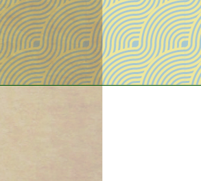
In this poster, a texture was brought in as the background. Then a pattern was colored, created, and used behind the texture. He applied a transparency of 50% to the texture and the Multiply effect (in the transparency panel). To make the pattern a bit more subtle, a transparency of 50% was applied to that.
Patterns in Inkscape
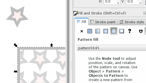
Working with patterns in Inkscape is a bit different from Illustrator. But there are a couple of different ways that you can make patterns in Inkscape. The first is via the Pattern Fill Option in the Fill and Stroke Panel:
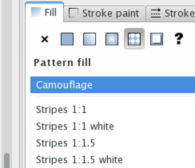
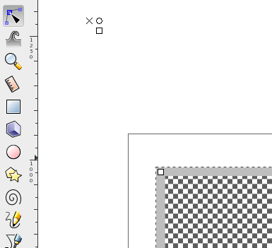
Click the Fill tab in the Fill and Stroke Panel, and then click the Pattern Fill Icon (see above) to fill your shape with a pattern and select a pattern type from the dropdown list. Using the Node Tool (looks like an arrow pointing at a square, right below the selection tool in the Left Panel) you can adjust the pattern fill by clicking your shape and then manipulating the pattern nodes. Note: You may need to zoom out to see the pattern nodes, as seen here:
Additionally you can make a pattern if you already have a pattern shape (like what you’d get if you downloaded a vector pattern). To do this you just need to create your pattern tile (the thing you’d like to have repeated for your pattern) and then click Object > Pattern > Object to Pattern. Now in the Fill Tab (Fill and Stroke Panel) you will find your new pattern in the dropdown list of available patterns under the Pattern Fill Icon.
If you’d like to try this method, this site has a list of hundreds of patterns you can implement. Practice a bit and get used to the pattern generation process.
Anthony’s ONS poster actually incorporates all three of the above techniques for the background.
In this poster, a texture was brought in as the background. Then a pattern was colored, created, and used behind the texture. He applied a transparency of 50% to the texture and the Multiply effect (in the transparency panel). To make the pattern a bit more subtle, a transparency of 50% was applied to that.