#SciFund Challenge Class
Part 4: Planning Your Poster Layout
The best posters are the ones that have been planned methodically. We’re going to be laying the foundation of our poster by first preparing an outline of our content (like you would for a paper) and then building a wireframe of the poster layout.
In web design, a wireframe is a static mockup of the design and interface for a website (most likely one in development). This is the first step in website creation and allows the designer to test multiple layouts with relatively little effort and distraction in order to determine the best layout for the site.
In our case, we will be looking to determine what works best from a design standpoint and how readers will interact with the poster. In order to have the best poster, your design will incorporate an ideal layout to provide the best reader experience. Fail and you will quickly drive visitors away from your poster.
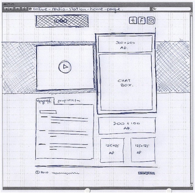
Wireframing allows you to troubleshoot the causes of poor layout before you have invested a lot of time on the design. The following example (sadly, only lightly fictionalized from a real life poster we have seen) demonstrates a layout that is confusing to read.

As you can see the left side of the poster has a one column layout but the right two-thirds of the poster has a two column layout and it isn’t clear what the intended reading direction is. The spacing between sections also varies which only adds to the confusion.
Again, having prepared a wireframe of basic boxes and dummy text would greatly help to ensure that this confusion doesn’t exist in the final poster design.
Exercise 3: Creating your outline
Before we can build our wireframe, we need to first identify what our poster content will be. Read this post by Zen Faulkes which talks about the importance of the poster outline.
Let's get rolling on our content by first coming up with our own poster outline. Here's the number one thing to keep in mind about that outline. Remember that your potential audience - even in an ideal case - will only be spending a fraction of the time absorbing your poster as they would a paper. As a result, your outline needs to be focused on as few as possible big take-away ideas (with one being the ideal). If you throw too many big ideas in the soup, there's a good chance that your audience won't register anything from your poster at all, in the brief time that they engage with it. So, focus your outline on the central messages that you developed in Exercise 2.
There are many different ways to create an outline, and we encourage you to do what works for you. You can be as in-depth or brief as you’d like because these are your notes, but do flesh out your complete story (remember though, that the point of the story - at least as far as the poster is concerned - is to get conversations rolling). And even though your poster isn’t linear, it is okay that your outline will be. You can prepare a standard outline relatively similar to the one you would put together for a journal publication.
Alternatively, you could try a non-linear outlining method. For a poster on Open Notebook Science, Anthony Salvagno used one outline method (known as mind mapping) to list big picture content and guide his layout. Here is his outline:
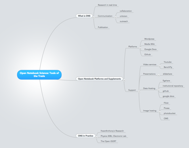
In this outline, you can see the hierarchy of ideas. The blue box provides the core idea for the poster, which then branches out to the points that support his core idea.
And here is the final poster based on this outline:
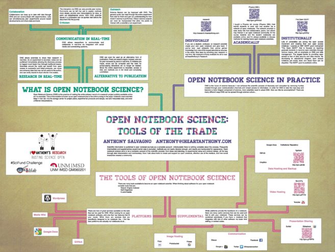
You can clearly see how the idea hierarchy of Anthony’s outline maps onto the final poster. If you'd like to try mind mapping for yourself as a model for building your own outline, here's more information about it. Otherwise, go with whatever way of outlining that works particularly well for you.