This material is cross-posted to Synthetic Daisies. This is part of a continuing series on the science of science (or meta-science, if you prefer). The last post was about the structure and theory of theories.

In this post, I will discuss the role of data analysis and interpretation. Why do we need data, as opposed to simply observing the world or making up stories? The simple answer: it gives us a systematic accounting of the world in general and experimental manipulations in particular. As opposed to the apparition on a piece of toast, it provides a systematic accounting of the natural world independent of our sensory and conceptual biases. But as we saw in the theory of theories post, and as we will see in this post, it takes a lot of hard work and thoughtfulness. What we end up with is an analysis of analyses.
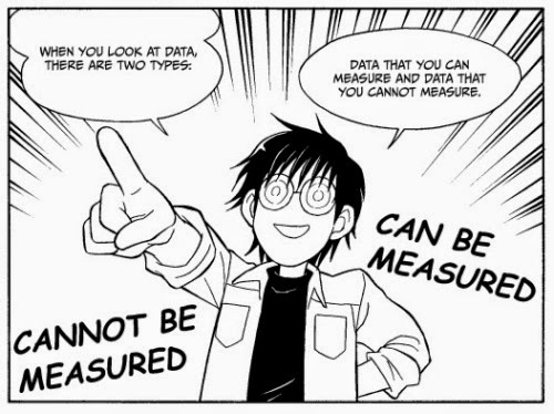
Data take many forms, so approach analysis with caution. COURTESY: [1].
Introduction
What exactly is data, anyways? We hear a lot about it, but rarely stop to consider why it is so potentially powerful. Data are both an abstraction of and incomplete sampling (approximation) of the real world. While the data are not absolute (e.g. you can always have more data or more completely sample the world), the data provide a means of generalization that is partially free from stereotyping. And as we can see in the cartoon above, not all data that influence our hypothesis can even be measured. Some of it is beyond the scope of our current focus and technology (e.g hidden variables), while some of it consists of interactions between variables.
In the context of the theory of theories, data has the same advantage over anecdote that deep, informed theories have over naive theories. In the context of the analysis of analyses, data does not speak for itself. To conduct a successful analysis of analysis, it is important to be both interpretive and objective. Finding the optimal balance between each of these gives us an opportunity to reason more clearly and completely. If this causes some people to lose their view of data as infallible, then so be it. Sometimes the data fails us, and other times we fail ourselves.
When it comes to interpreting data, the social psychologist Jon Haidt suggests that “we think we are scientists, but we are actually laywers” [2]. But I would argue this is where the difference between the untrained eyes sharing Infographics and the truly informed acts of analysis and data interpretation becomes important. The latter is an example of a meta-meta-analysis, or a true analysis of analyses.

The implications of Infographics are clear (or are they?) COURTESY: Heatmap, xkcd.
NHST: the incomplete analysis?
I will begin our discussion with a current hot topic in the field of analysis. It involves interpreting statistical “significance” using an approach called Null Hypothesis Statistical Testing (or NHST). If you have even done a t-test or ANOVA, you have used this approach. The current discussion about the scientific replication crisis is tied to the use (and perhaps overuse) of these types of tests. The basic criticism involves the inability of NHST statistics to conduct multiple tests properly and properly deal with experimental replication.

Example of the NHST and its implications. COURTESY: UC Davis StatWiki.
This has even led scientists such as John Ioannidis to demonstrate why “most significant results are wrong”. But perhaps this is just to make a rhetorical point. The truth is, our data are inherently noisy. Too many assumptions/biases go into collecting most datasets, all for data which has too little known structure. Not only are our data noisy, but in some cases may also possess hidden structure which violates the core assumptions of many statistical tests [3]. Some people have rashly (and boldly) proposed that this points to flaws in the entire scientific enterprise. But, like most things, this does not take into account the nature of the empirical enterprise and reification of the word significance.

A bimodal (e.g. non-normal) distribution, being admonished by its unimodal brethren. Just one case in which the NHST might fail us.
The main problem with the NHST is that it relies upon distinguishing signal from noise [4], but not always in the broader context of effects size or statistical power. In a Nature News correspondence [5], Regina Nuzzo discusses the shortcomings of the NHST approach and tests of statistical significance (e.g. p-values). Historical context of the so-called frequentist approach [6] is provided, and its connection to assessing the validity of experimental replications are discussed. One possible solution is the use of Bayesian techniques [7] to assess something called statistical power. The Bayesian approach allows one to use a prior distribution (or historical conditioning) to better assess the meaningfulness of one’s statistically significant result. But the construction of priors relies on the existence of reliable data. If these data do not exist for some reason, we are back to square one.
Big Data and its Discontents
Another challenge to conventional analysis involves the rise of so-called big data. Big data is the collection and analysis of very large datasets, which come from sources such as high-throughput biology experiments, computational social science, open-data repositories, and sensor networks. Considering their size, big data analyses should allow for good power and ability to distinguish signal from noise. Yet due to their structure, we are often required to rely upon correlative analyses. While correlation is equated with relational information, it (as it always has) does not equate to causation [8]. Innovations in machine learning and other data modeling techniques can sometimes overcome this limitation, but correlative analyses are still the easiest way to deal with these data.

IBM’s Watson: powered by large databases and correlative inference. Sometimes this cognitive heuristic works well, sometimes not so much.
Given a large enough collection of variables with a large number of observations, correlations can lead to accurate generalizations about the world [9]. The large number of variables are needed to extract relationships, while the large number of observations are needed to understand the true variance. This can be a problem where subtle, higher-order relationships (e.g. feedbacks, time-dependent saturations) exist or when the variance is not uniform with respect to the mean (e.g. bimodal distributions).
Complex Analyses
Sometimes large datasets require more complicated methods to find relevant and interesting features. These features can be thought of as solutions. How do we use complex analysis to find these features? In the world of analysis of analyses, large datasets can be mapped to solution spaces with a defined shape. This strategy uses convergence/triangulation as a guiding principle, but does so through the rules of metric geometry and computational complexity. A related and emerging approach called topological data analysis [10] can be used to conduct rigorous relational analyses. Topological data analysis takes datasets and maps them to a geometric shape (e.g. topology) such as a tree or in this case a surface.
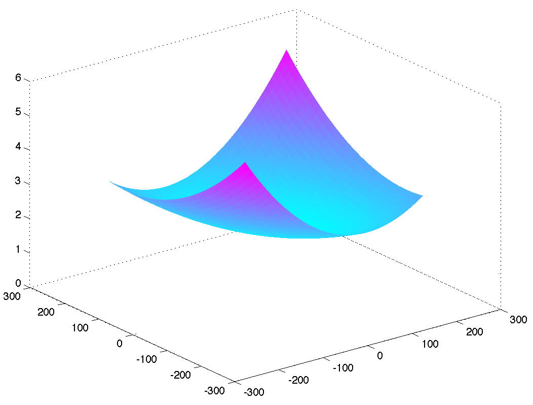
A portrait of convexity (quadratic function). A gently sloping dataset, a gently sloping hypothesis space. And nothing could be further from the truth……
In topological data analyses, the solution space encloses all possible answers on a surface, while the surface itself has a shape that represents how easy it is to move from one portion of the solution space to another. One common assumption is that this solution space is known and finite, while the shape is convex (e.g. a gentle curve). If that were always true, then analysis would be easy: we could use a moderate large-sized dataset to get the gist of patterns in the data. any additional scientific inquiry would constitute filling in the gaps. And indeed sometimes it works out this way.
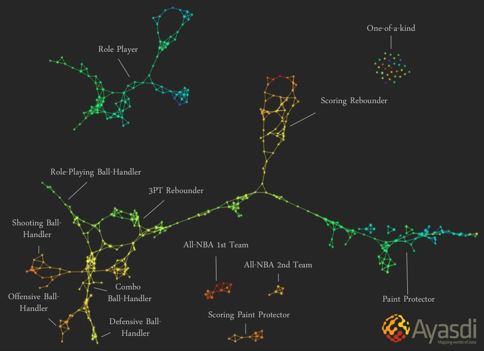
One example of a topological data analysis of most likely Basketball positions (includes both existing and possible positions). COURTESY: Ayasdi Analytics and [10].
The Big Data Backlash…..Enter Meta-Analysis
Despite its successes, there is nevertheless a big data backlash. Ernest Davis and Gary Marcus [11] present us with nine reasons why big data are problematic. Some of these have been covered in the last section, while others suggest that there can be too much data. This is an interesting position, since it is common wisdom that more data always give you more resolution and insight. Insight and information can be obscured by noisy or irrelevant data. But even the most informative of datasets can yield misinformed analyses if the analyst is not thoughtful.
Of course, ever-bigger datasets by themselves do not give us the insights necessary to determine whether or not a generalized relationship is significant. The ultimate goal of data analysis should be to gain deep insights into whatever the data represent. While this does involve a degree of interpretive subjectivity, it also requires an intimate dialogue between analysis, theory, and simulation. Perhaps the latter is much more important, particularly in cases where the data are politically or socially sensitive. These considerations are missing from much contemporary big data analysis [12]. This vision goes beyond the conventional “statistical test on a single experiment” kind of experimental investigation, and leads us to meta-analysis.
The basic premise of a meta-analysis is to use a strategy of convergence/triangulation to converge upon results using a series of studies. The logic here involves using the power of consensus and statistical power to arrive at a solution. The problem is represented as a series of experiments with an effect size for each. For example, if I believe that eating oranges causes cancer, how should I arrive at a sound conclusion? One study with a very large effect size, or many studies with various effect sizes and experimental contexts. According to the meta-analysis view, the latter should be most informative. In the case of potential factors in myocardial infarction [13], significant results that all point in the same direction (with minimum effect size variability) lend the strongest support to a given hypothesis.
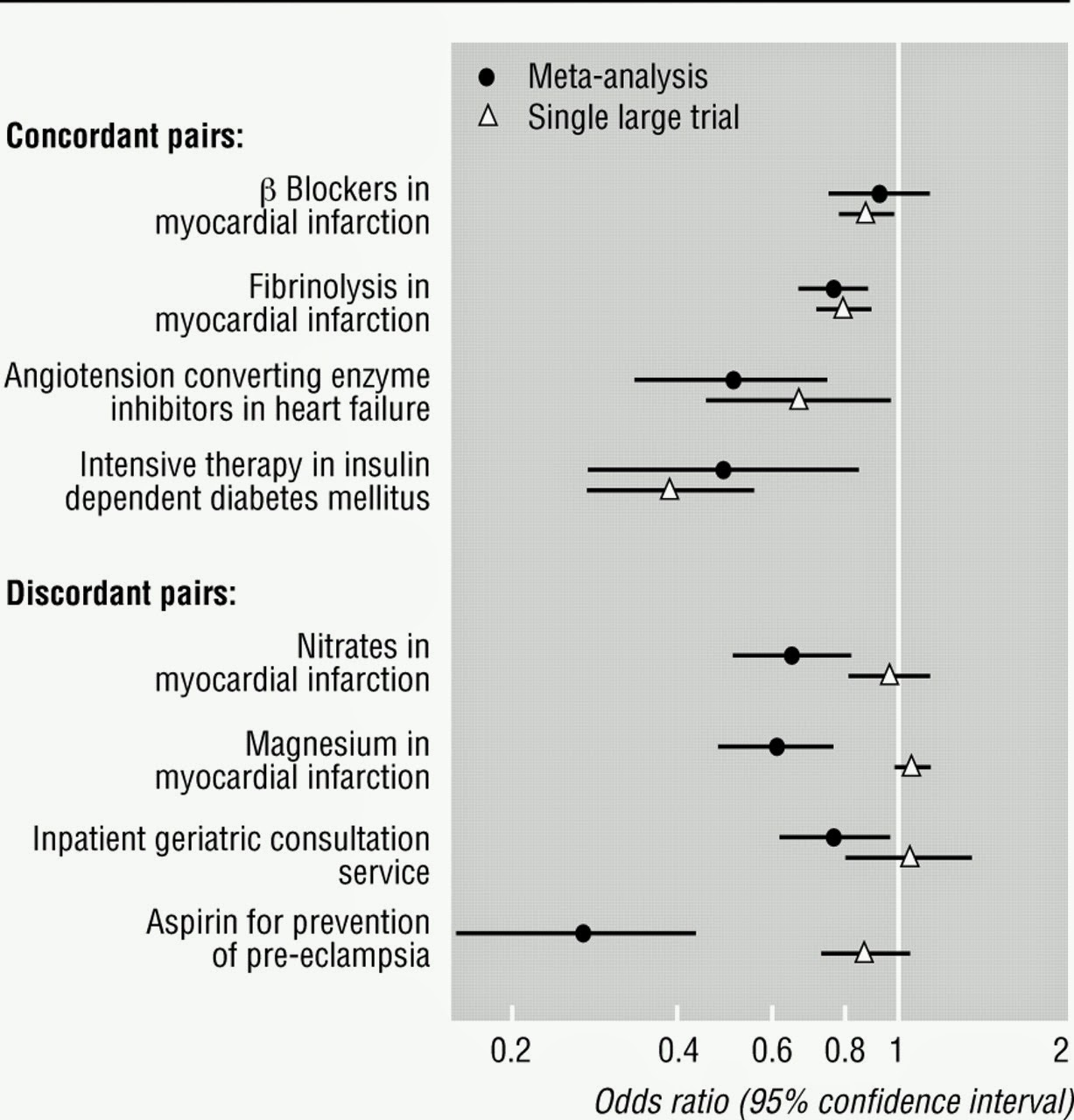
Example of a meta-analysis. COURTESY: [13].
The Problem with Deep Analysis
We can go even further down the rabbit hole of analysis, for better or for worse. However, this often leads to problems of interpretation, as deep analyses are essentially layered abstractions. In other words, they are higher-level abstractions dependent upon lower-level abstractions. This leads us to a representation of representations, which will be covered in an upcoming post. Here, I will propose and briefly explore two phenomena: significant pattern extraction and significant reconstructive mimesis.
One form of deep analysis involves significant pattern extraction. While the academic field of pattern recognition has made great strides [14], sometimes the collection of data (which involve pre-processing and personal bias) is flawed. Other times, it is the subjective interpretation of these data which are flawed. In either case, this results in the extraction patterns that make no sense that are then assigned significance. Worse yet, some of these patterns are also thought to be of great symbolic significance [15]. The Bible Code is one example of such pseudo-analysis. Patterns (in this case secret codes) are extracted from a database (a book), and then these data are probed for novel but coincidental pattern formation (codes formed by the first letter of every line of text). As this is usually interpreted as decryption (or deconvolution) of an intentionally placed message, significant pattern extraction is related to the deep, naive theories discussed in “Structure and Theory of Theories”.

Congratulations! Your pattern recognition algorithm came up with a match. Although if it were a computer instead of a mind, it might do a more systematic job of rejecting it as a false positive. LESSON: the confirmatory criteria for a significant result needs to be rigorous.
But suppose that our conclusions are not guided by unconscious personal biases or ignorance. We might intentionally leverage biases in the service of parsimony (or making things simpler). Sometimes, the shortcuts we take in representing natural processes present difficulties in understanding what is really going on. This is a problem of significant reconstructive mimesis. In the case of molecular animations, this has been pointed out by Carl Zimmer [16] and PZ Myers [17] for molecular animations. In most molecular animations, processes occur smoothly (without error) and within full view of the human observer. Contrast this with the inherent noisiness and spatially-crowded environment of the cell, which is highly realistic but not very understandable. In such cases, we construct a model which consists of data, but that model is selective and the data is deliberately sparse (in this case smoothed). This is an example of a representation (the model) that informs an additional representation (the data). For purposes of simplicity, the model and data are somehow compressed to preserve signal and remove noise. And in the case of a digital image file (e.g. .jpg, .gif) such schemes work pretty well. But in other cases, the data are not well-known, and significant distortions are actually intentional. This is where big challenges arise in getting things right.

An multi-layered abstraction from a highly-complex multivariate dataset? Perhaps. COURTESY: Salvador Dali, Three Sphinxes of Bikini.
Conclusions
Data analysis is hard. But in the world of everyday science, we often forget how complex and difficult this endeavor is. Modern software packages have made the basic and well-established analysis techniques deceptively simple to employ. In moving to big data and multivariate datasets, however, we begin to face head-on the challenges of analysis. In some cases, highly effective techniques have simply not been developed yet. This will require creativity and empirical investigation, things we do not often associate with statistical analysis. It will also require a role for theory, and perhaps even the theory of theories.
As we can see from our last few examples, advanced data analysis can require conceptual modeling (or representations). And sometimes, we need to map between domains (from models to other, higher-order models) to make sense of a dataset. This, the most complex of analyses, can be considered representations of representations. Whether a particular representation of a representation is useful or not depends upon how much noiseless information can be extracted from the available data. Particularly robust high-level models can take very little data and provide us with a very reliable result. But this is an ideal situation, and often even the best models presented with large amounts of data can fail to given a reasonable answer. Representations of a representations also provide us with the opportunity to imbue an analysis with deep meaning. In a subsequent post, I will this out in more detail. For now, I leave you with this quote:
“An unsophisticated forecaster uses statistics as a drunken man uses lampposts — for support rather than for illumination.” Andrew Lang.
NOTES:
[1] Learn Statistics with Comic Books. CTRL Lab Notebook, April 14 (2011). [2] Mooney, C. The Science of Why We Don’t Believe Science. Mother Jones, May/June (2011). [3] Kosko, B. Statistical Independence: What Scientific Idea Is Ready For Retirement. Edge Annual Question (2014). [4] In order to separate signal from noise, we must first define noise. Noise is consistent with processes that occur at random, such as the null hypothesis or a coin flip. Using this framework, a significant result (or signal) is a result that deviates from random chance to some degree. For example, a p-value of 0.05 represents a 95% chance that the replicates observed could not have occurred due to chance. This is, of course, an incomplete account of the relationship between signal and noise. Models such as Signal Detection Theory (SDT) or data smoothing techniques can also be used to improve the signal-to-noise ratio. [5] Nuzzo, R. Scientific Method: Statistical Errors. Nature News and Comment, February 12 (2014). [6] Fox, J. Frequentist vs. Bayesian Statistics: resources to help you choose. Oikos blog, October 11 (2011). [7] Gelman, A. So-called Bayesian hypothesis testing is just as bad as regular hypothesis testing. Statistical Modeling, Causal Inference, and Social Science blog, April 2 (2011). [8] For some concrete (and satirical) examples of how correlation does not equal causation, please see Tyler Vigen’s Spurious Correlations blog. [9] Voytek, B. Big Data: what’s it good for? Oscillatory Thoughts blog, January 30 (2014).It is interesting to note that the practice of statistical pattern recognition (training a statistical model with data to evaluate additional instances of data) has developed techniques and theories related to rigorously rejecting false positives and other spurious results.
[15] McCardle, G. Pareidolia, or Why is Jesus on my Toast? Skeptoid blog, June 6 (2011). [16] Zimmer, C. Watch Proteins Do the Jitterbug. NYTimes, April 10 (2014). [17] Myers, P.Z. Molecular Machines! Pharyngula blog, September 3 (2006).