If you’re communicating your science to others, you’re probably going to be showing some figures. But what makes for a good figure? If you are planning a figure for a publication, information density is usually the name of the game – after all, complex ideas might require dense figures.
Here’s the issue with information-dense figures: they take time for the viewer to digest. That’s fine for a print publication, where the viewer has unlimited time to understand what’s going on. However, if you are displaying that figure in any other context (presentation, poster, video, etc.), the time situation changes completely. Your audience now has much less time (or is much less willing to spend the time) to make sense of your figures. As a consequence, non-publication-bound figures must be designed for speed – to communicate your message in a minimum of comprehension time.
Take a look at the figure below, designed for a journal, that illustrates the effect that water-type has on yeast growth (figure by Anthony Salvagno, Ph.D.).

There’s clearly a lot going on in this figure. If we want to present this figure in a poster format – for example – we need to trim down the complexity to highlight the main point: the differences between the most extreme water types (normal H2O vs D2O). Take a look at the transformed figure below.
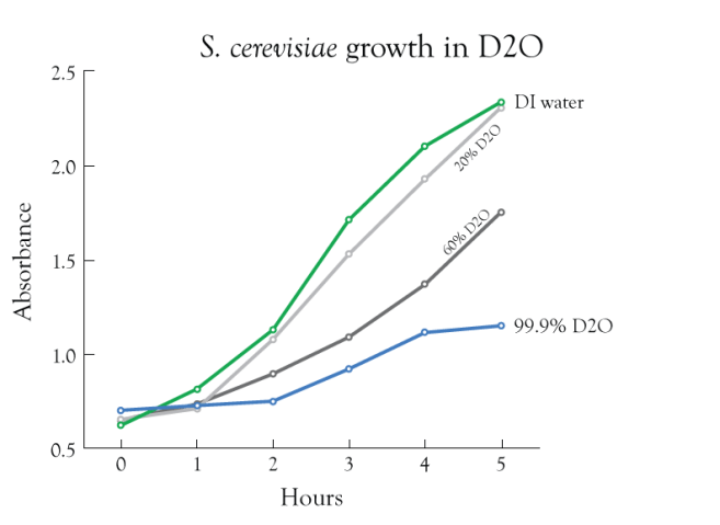
In the above figure, the color usage was reduced to eliminate a lot of the visual distraction. Additionally, some data was removed to again eliminate distraction. Notice how much more quickly the main point of emphasis jumps out at you.
Interested in learning more about creating compelling figures? SciFund Challenge has a lot more to say about it in our Academic Posters class. Here’s the relevant section of the class material.