Are you a scientist trying to get a message across to other folks? If so, you’ll probably need to have some compelling images to close the deal. After all, imagery plays a big role in all kinds of scientific communication formats (just think of academic talks or poster presentations).
But what’s the secret to creating compelling images – images that actually grab the attention of your audience? One easy thing that you can do is to use something called the Rule of Thirds. It’s an foundational idea in photography, but you don’t have to save it for just photos.
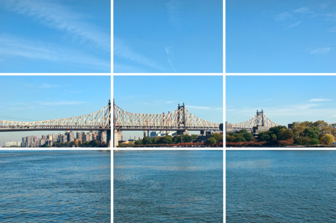
Here’s the idea. Beginning photographers tend to put their subjects in the exact middle of the frame. However, pictures often look more interesting if the subject is not centered. Take a look below at this image taken with the Rule of Thirds in mind:

With the Rule of Thirds, the image is divided into three equally-sized rows and columns. Having the focal point a third of the way from the edge (top or bottom) is considered the “sweet spot.”
In this case, elements of the bridge line with the vertical grid lines, while the water’s surface aligns with the bottom horizontal grid line.
To make it clearer, here’s that image again with the Rule of Thirds grid overlaid.

You don’t even need to retake an image to make it more interesting. You can simply crop the image and align the subject (the image focal point) with this imaginary grid in mind.
Interested in learning more about creating great images? SciFund Challenge has a lot more to say about it in our Academic Posters class. Here’s the relevant section of the class material.
