Last week we spent a considerable amount of time getting to the core of our poster. We used the Message Box to pinpoint the fundamental themes of our poster topic. We also identified our take-home message, the vital information that we wanted our audience to leave with.
This week we are going to begin to package our content and start putting it in our poster file. The goal for this week will be to have a skeleton, or wireframe, of the layout of our poster complete with titles, headings, and dummy text.
Planning your poster layout
The best posters are the ones that have been planned methodically. This week we’re going to be laying the foundation of our poster by first preparing an outline of our content (like you would for a paper) and then building a wireframe of the poster layout.
In web design, a wireframe is a static mockup of the design and interface for a website (most likely one in development). This is the first step in website creation and allows the designer to test multiple layouts with relatively little effort and distraction in order to determine the best layout for the site.
In our case, we will be looking to determine what works best from a design standpoint and how readers will interact with the poster. In order to have the best poster, your design will incorporate an ideal layout to provide the best reader experience. Fail and you will quickly drive visitors away from your poster.
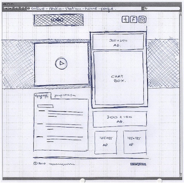
Wireframing allows you to troubleshoot the causes of poor layout before you have invested a lot of time on the design. The following example demonstrates a layout that is confusing to read:
As you can see the left side of the poster has a one column layout but the right two-thirds of the poster has a two column layout and it isn’t clear what the intended reading direction is. The spacing between sections also varies which only adds to the confusion.
Again, having prepared a wireframe of basic boxes and dummy text would greatly help to ensure that this confusion doesn’t exist in the final poster design.
Creating an outline
Before we can build our wireframe, we need to first identify what our poster content will be. Read this post by Zen which talks about the importance of your poster outline.
For this you will want to write an outline using your message box as your guide. The purpose of the outline is to identify what your poster content will be. In doing this, it will be much easier to design your wireframe.
There are many different ways to create an outline, and we encourage you to do what works for you. You can be as in-depth or brief as you’d like because these are your notes, but be complete. You will want to have an overview of your complete research story here. And even though your poster isn’t linear, it is ok that your outline will be. You can prepare a standard outline like you would for a journal publication:
- Title
- Intro
- Methods
- description
- Results
- description
- figure of graph
For a poster on Open Notebook Science, Anthony used one outline method (known as mindmapping) to list big picture content and guide his layout. Here is his outline:
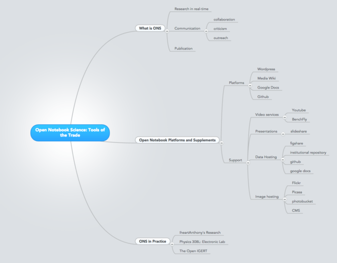
In this outline, you can see the hierarchy of ideas. The blue box provides the core idea for the poster, which then branches out to the points that support his core idea.
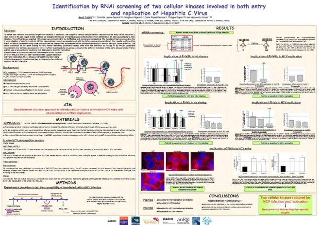
And here is the final poster based on this outline:
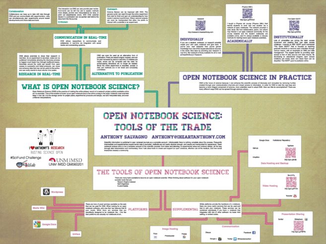
You can clearly see how the idea hierarchy of Anthony’s outline maps onto the final poster.
We should be clear here that there are many ways of outlining your poster. If you have a way that works particularly well for you, go with that. Otherwise, we suggest you try using Anthony’s outline as a template for building your own outline.
Designing your wireframe
Once you have your outline prepared, you’ll be able to start designing your wireframe and laying out your content. There is no secret or standard technique to wireframing, so just start experimenting, but keep in mind the following visual theories.
Conference posters are a visual medium
Academic conference posters are the illegitimate children of journal articles and billboards, and people often want to ignore one of the parents. For conference posters, the billboard heritage tends to get forsaken in favour of the journal heritage.
This is not surprising. Most academics are very comfortable with words and numbers – writing and data analysis are key skills for most academics. The form of communication academics know best is the journal article, and they often try to make everything look like a journal article. As the saying goes, when the only tool you have is a hammer, every problem looks like a nail.
But a good conference poster presents a strong image, not just hypotheses and data.
Design to show your professionalism
When you design something, it helps to start with what designers call a “brief”: a list of parameters that the object you’re making has to meet. You can see an example of one for conference posters here. In part, it says:
Academics will generally want to convey an impression of rigor, thoughtfulness, thoroughness, and careful attention to detail.
There are several elements of a design that help convey the professionalism an academic wishes to convey. Here are a few to consider at first.
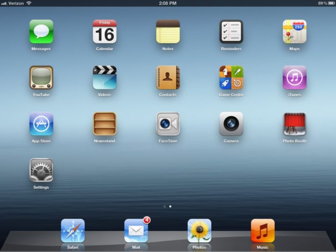
Grids and alignment: We recognize that it takes care and effort to make things line up. Look at the screen on an iPad and see how the icons line up. Creating a grid for a poster and getting all the elements – text, graph, or picture – to line up on that grid improves the appearance of any poster dramatically.
Consistency: Consistency also shows that the person making a poster paid attention to detail. Consistency on a poster comes in many forms: the font used, the size of the type, the choice of colours, the punctuation, the width of columns, and so on. This extends to the choice of material you include on the poster: everything on the poster should be consistent with the major message you want your viewer to remember. (And you should know what that message is from the Message Box exercise in Week 1!)
White space: Many academics are convinced that the data and words are the most important things on a poster, and try to fit as much of that on the paper as they possibly can. This makes for crowded layouts, but while crowds can be exciting, they are disorganized and messy. White (“empty”) space is one of the most powerful tools a designer has. White space can divide and organize elements on a page better than lines and boxes. Ample space conveys luxury. Again, an iPad screen is an excellent example: most of the screen is taken up with the space between the icons.
Hierarchy: Not every aspect of a poster is equally important. For instance, the title of the poster is more important than the acknowledgments. In fact, the title is probably more important than any other part of the poster! The key conclusions of a poster are more important than methodological details. There are many cues to you can use to signal what is important on a poster.
- Size: bigger means more important.
- Position: higher (or closer to eye level) is more important.
- Font styles: Bolding, italicizing, and capitalization can all signal importance.
- Colour: Bright or high contrast colours can signal importance.
You do not need to use all of these simultaneously, however! In fact, you probably shouldn’t.
The five elements listed above are not a complete list of design elements for a poster, but they are a good starting point for thinking about how every aspect of a poster contributes to its overall visual impression.
Wireframe examples
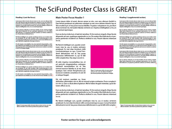
To the left, you can see a simple wireframe, created by Anthony. There are an infinite number of possible layouts you can choose for your poster and we want to emphasize that this wireframe is provided for illustration, not as an example of a layout that you should necessarily emulate. As an example of a point not to emulate, this wireframe is definitely too text heavy
Nonetheless, there are multiple things to notice in this wireframe.
- The wireframe has a three column format to clearly indicate the hierarchy of ideas. The main idea is in the center column, which has a much larger font size than the other two columns. From a distance, you would only clearly be able to read the center column, drawing the eye there. The supporting ideas can be found in the left and right columns.
- You’ll notice that most of the text itself is in Latin, which might seem odd. However, the use of Latin text is a standard design tool. By throwing Latin down, you can see what the text layout looks like, without being distracted by what the words are actually saying. There are many online Latin text generators for this precise purpose and we’ll suggest one further down in these instructions.
- The blue, green, and magenta boxes correspond to figures for the poster.
- The light blue lines on the outside of the wireframe are guides to help organize content. Guides are a fantastic way to ensure that all your content lines up. A key point about guides is that they do not show up in the final product. There are many ways to use guides in a wireframe, with their use determined by your particular design choices. Here are how guides are used here.
- The center section, delineated by the inner guides, indicates where the main content of this poster will go.
- The outer section, delineated by the zone exterior to the outer guides, provides a half-inch margin around the edge of the wireframe. No element of the poster is in this section.
- The middle section, between the outer and inner guides, gives a 2-inch wide space for header and footer information (the title above and acknowledgements below).
- If you look carefully at the wireframe, you will notice a small red box at the bottom right of each column. This red box is the Illustrator way of telling you that there is extra text that does not fit within the space provided. The red box will only show up in Illustrator and not in your final output (the extra text just won’t show in that output).
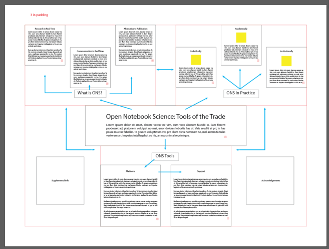
Here is a more complicated wireframe, which is what Anthony actually used to design his Open Notebook Science poster.
- The first thing to notice about this wireframe is that it does not use the standard multi-column format so common to conference posters. Instead, the main idea of the poster is at the center of the poster, which is indicated by the large font sizes used in the center box. Both the title and the dummy text in the center box use a larger font size than anywhere else in the wireframe.
- Supporting ideas flow outward and around from the center box. The blue arrows indicate reading direction. This wireframe is organized so that a visitor can begin reading at any branch and then move around either clockwise or counterclockwise. For this poster, the arrows won’t be there in the final product. They exist solely to help plan the reading flow.
- Dummy text (the latin) is used again to give an idea of how much content will be provided.
- Figures are shown as yellow boxes.
- For this wireframe, the black outlined boxes indicate where content will go. Only elements within these boxes will show up in the final product.
- In this particular example, the red lines (guides) organize the wireframe space into general categories, with each category containing one or more content boxes. As with the previous wireframe, the guides in this wireframe will not show up in the final output. There are seven categories created by the guides in this wireframe.
- An outer section, delineated by the zone exterior to the red guides, provides a three-inch margin around the edge of the wireframe. No element of the poster is in this section.
- What is ONS?
- ONS in Practice
- Supplemental Info
- ONS Tools
- Acknowledgements
- The center box (you can’t see the red guides because black lines exactly overlay them).
Below you can see the final version of the Open Notebook Science poster again. Hopefully, you can clearly see how the wireframe design leads directly to this output.
Building your wireframe with Illustrator
Now that we understand what to consider in our wireframe composition, we can begin to build it. It may be best to start by rough sketching (with pencil and paper) a few different layouts that you think may work best, just to get a sense of space before you move to Illustrator. For example, ask how many graphs and pictures you need to include so that you can block out the space those will need.
Remember that poster artboard we made last week with the specifications of the poster you wanted? Open that file and start working in there. If you preset your artboard to a size that you now think is too small or too large, don’t fret because you can change your artboard size. This video will quickly show you how to do so:
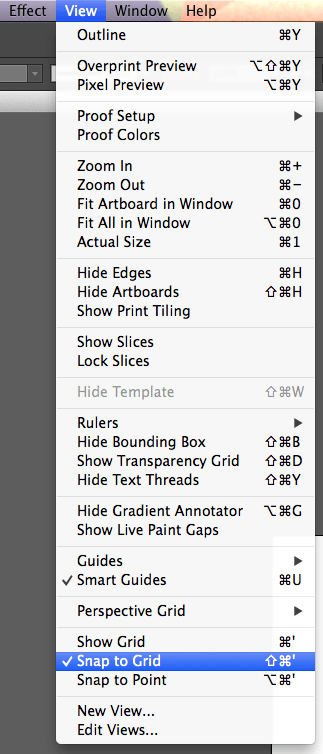
At this point it will be a good idea to set up guides that will make it easy to divide your artboard into sections. You can create guides and lock them down so they don’t move. If you want to align a shape to the guide Smart Guides will snap your objects to the guide (see the Week 1 tutorial, or navigate to View and then click Smart Guides). This tutorial provides good instruction on creating guides, manipulating them, and using the ruler function of Adobe Illustrator.
One additional note on guides: You can make any shape a guide by selecting it and then navigating to View > Guides > Make Guides. This is very handy to align objects with areas
As you build your wireframe you’ll want to start organizing it, ie using your grid and aligning your shapes and text to that grid. Last week’s video tutorial showed you how to turn on the Illustrator alignment grid. You can also enable the Snap to Grid feature which will constrain shapes to grid points and will make it easy to manually align objects. Just navigate to View at the very top of Illustrator and click Snap to Grid in the drop down menu.
For more on object alignment, the following video walks you through the Alignment Panel and how you can align your shapes in different ways.
Now you can begin to create the shapes that will later become your poster content. It may be easiest to begin with your title. This will be the largest object on your poster so be sure to provide enough space so that your title could be read at distance. Think of your title as 90% of your communication effort!
Make sure your title is easily readable from a distance since this is a key element of your poster to draw people in. Make sure your title is at least 1 inch tall (apologies for the non-metric units, but that’s how US-based designers roll). Fonts are measured in points, and 72 pt normally equals letters 1 inch high. But this isn’t true for every font, so pay attention if you switch fonts.
You should also make boxes that will contain your text to organize your columns and reading direction. Start each box with the section header and then add paragraph dummy text using this Lorem Ipsum generator. For normal paragraph text you’ll want probably want to use 16-18 pt font depending on how much space you have, while for headings you’ll want to use a size considerably larger (like 24pt font) but not as large as your title.
The following tutorial will show you how to size, place, and modify text properties.
And this tutorial will show you how to work with shapes.
Once you are finished building your wireframe, save your file as you did last week. This week I also want you to save a low filesize version that we will be uploading to the Google+ Community. We can do this with a function in the File menu called Save for Web. Check out the following video to learn how to save a version of your poster that you can upload to the Google+ Community.
Assignments
- Sign up for and attend a hangout this week.
- Create an outline for your poster. Remember the goal is to have a clear idea of what your poster content will be. Use your message box and take-home message to help stay on track. With that said, use any outlining method that works for you, and be as detailed as you would like.
- Optional: Share your outline on the G+ page.
- Build a wireframe of your poster, based on your outline. Make sure that you:
- Create guides for your poster. First, make a boundary around your document where there will be no content. Then use guides to divide your artboard into sections. Also, be sure to use guides to create white space between sections. Having a lot guides will make it easy for you to align objects and define your poster sections and space. These guides will disappear when you save the file to share your work with the class and in the final print.
- Create shapes to indicate content areas.
- To keep things simple, use white boxes with black outlines for content areas. You can make any shape this color scheme by pressing Command and “d” on a Mac or Control and “d” on Windows.
- Using your outline for guidance, fill the content areas with: 1) your title, 2) headings, 3) figure placeholders, 4) dummy text for specific information to be added later, and 5) any other elements. For anything that serves as a placeholder for an object that you will add later, create a comparable shape and label that shape. You can generate dummy Latin text using this Lorem Ipsum generator.
- Be specific with your title and headings (don’t use dummy text here). In general it is a good idea to have specific heading titles. From the audience perspective, they will read 1000 different “Methods” headings, so having specific heading titles will help distinguish your poster from the masses.
- Adjust your font sizes to indicate hierarchy. This will inherently imply a reading direction, so be sure that important areas are more pronounced than supporting areas. The “Building your wireframe with Illustrator” section above gives specific guidance on font size.
- To get a feel for your use of poster space, make sure your artboard zoom is at 100% and move around your document. This will allow you to determine if you have enough space between sections. To get a feel for font sizes,try to view your computer screen from a few feet away.
- To zoom in/out using the keyboard, press the Command key and the plus/minus key together (if you’re on a Mac) or Control and plus/minus for windows.
- Save your poster both as an .ai file and as either a .png or .jpg. Follow along with the final tutorial above to do exactly this.
- Upload your PNG/JPEG image to the Google+ Community in the Week 2 Assignments section.
- Make sure to include your take-home message and audience (the exercise from Week 1) in your Google+ post.
- Provide feedback on at least 3 posters of classmates. Here are some things to look for when examining other posters:
- Does the title directly convey the take-home message?
- Do the headings stem from the core idea?
- Is there a clear reading flow across the poster? How can this be improved?
- Are the text sizes appropriate?
- What elements of the poster attract your eye? What elements are supposed to attract? If they are not the same, what could be done to get them to match?
- Are wireframe elements aligned consistently?
- Does the title directly convey the take-home message?
And for the sake of the exercise here is the complete process, one last time!