
Here it is, folks, the slick infographic of hotness that summarizes what we know about #SciFund. Be still your beating hearts. And if you haven’t, you have only a scant few days to sign up for #SciFund Round 2!!!
I’ve thrown a lot of stats, graphs, and path diagrams at you over the past few weeks summarizing #SciFund and what it takes to make a succesful project. There are still tons of things that we HAVE NOT quantified – the influence of tastemakers, change, and more. Indeed, if you have more questions that you want answered based on this data (and/or if you have a slick script to quantify secondary twitter network size), please let me know and I’ll check into it. I’ll also be posting more about some more qualitative observations (and data) in the future.
But for now, I think this infographic might sum up the whole story.
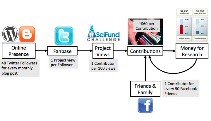
Having an online presence in a blog helps build your fanbase in various social networks. This leads to people viewing your project. Those views and your personal network of friends and family lead to contributions that then fund your research. But, there’s an important feedback. Success breeds success. People like to go with a winner, and if you’re able to breakout, people are even more willing to open their wallets to you.
If you think you have a better cooler way of summing all of this up in one hot graphic, here’s the raw powerpoint file I’m playing with. Feel free to play yourself and send it back. But, indeed, that’s the story!
Engage your with the world around you and fund your Science!!!
5 comments on “What have we learned: #SciFund in #Infographics”Add yours →
Comments are closed. You can not add new comments.